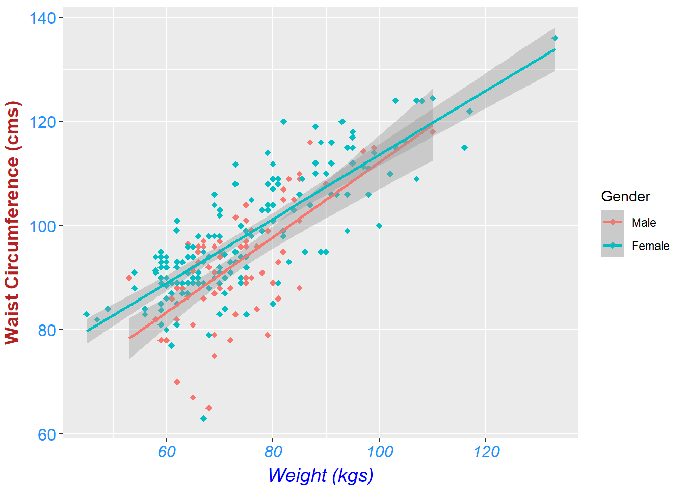
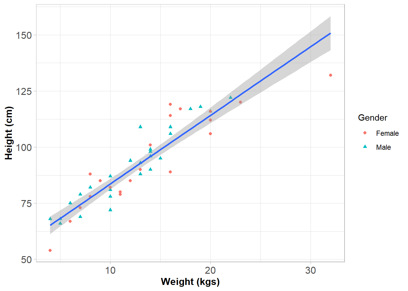
dat <- foreign::read.dta("C:/Dataset/bea_organ_damage_28122013.dta")dataF <- readstata13::read.dta13("C:/Dataset/olivia_data_wide.dta")df1 <-read.csv("C:\\Users\\Sbngu\\Dropbox\\Data for book\\booking1.csv")SC <- dat %>%select(q12weight, q13waist, q3sex, q10what) %>%drop_na() %>%ggplot(aes(x = q12weight, y = q13waist, color = q3sex))
Code
SC +geom_point(shape ="diamond", size =2) +labs(x ="Weight (kgs)", color ="Gender",y ="Waist Circumference (cms)") +geom_smooth(method ="lm", formula ="y ~ x") +theme(axis.title.x =element_text(vjust =0, size =14, color ="blue", face ="italic"),axis.title.y =element_text(vjust =2, size =14, color ="firebrick", face ="bold"),axis.text =element_text(color ="dodgerblue", size =12),axis.text.x =element_text(face ="italic"))
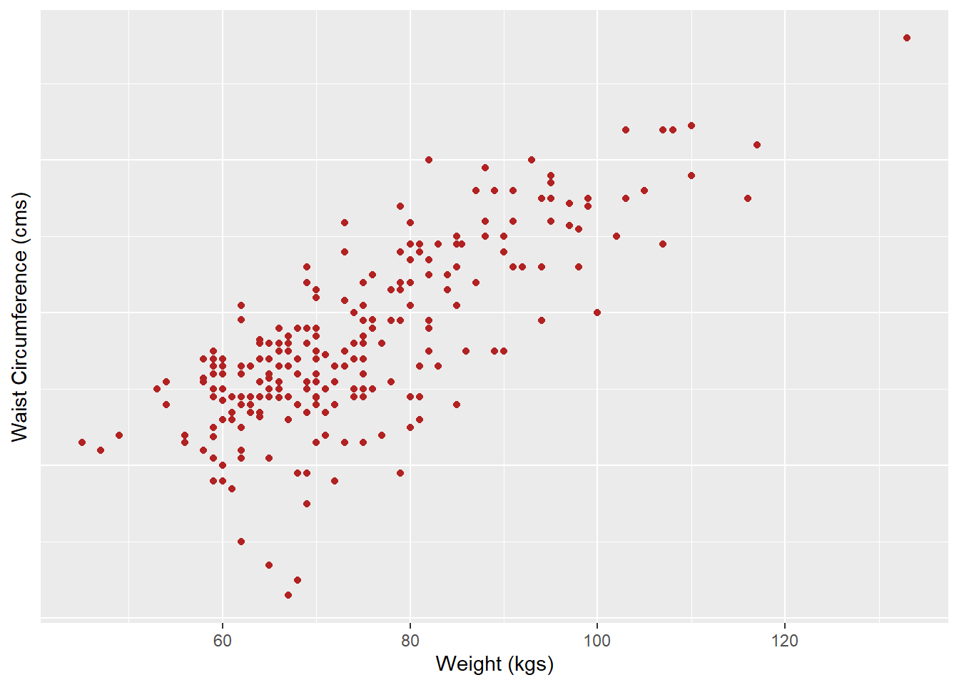
Figure 63.1: Relationship between weight and waist circunference
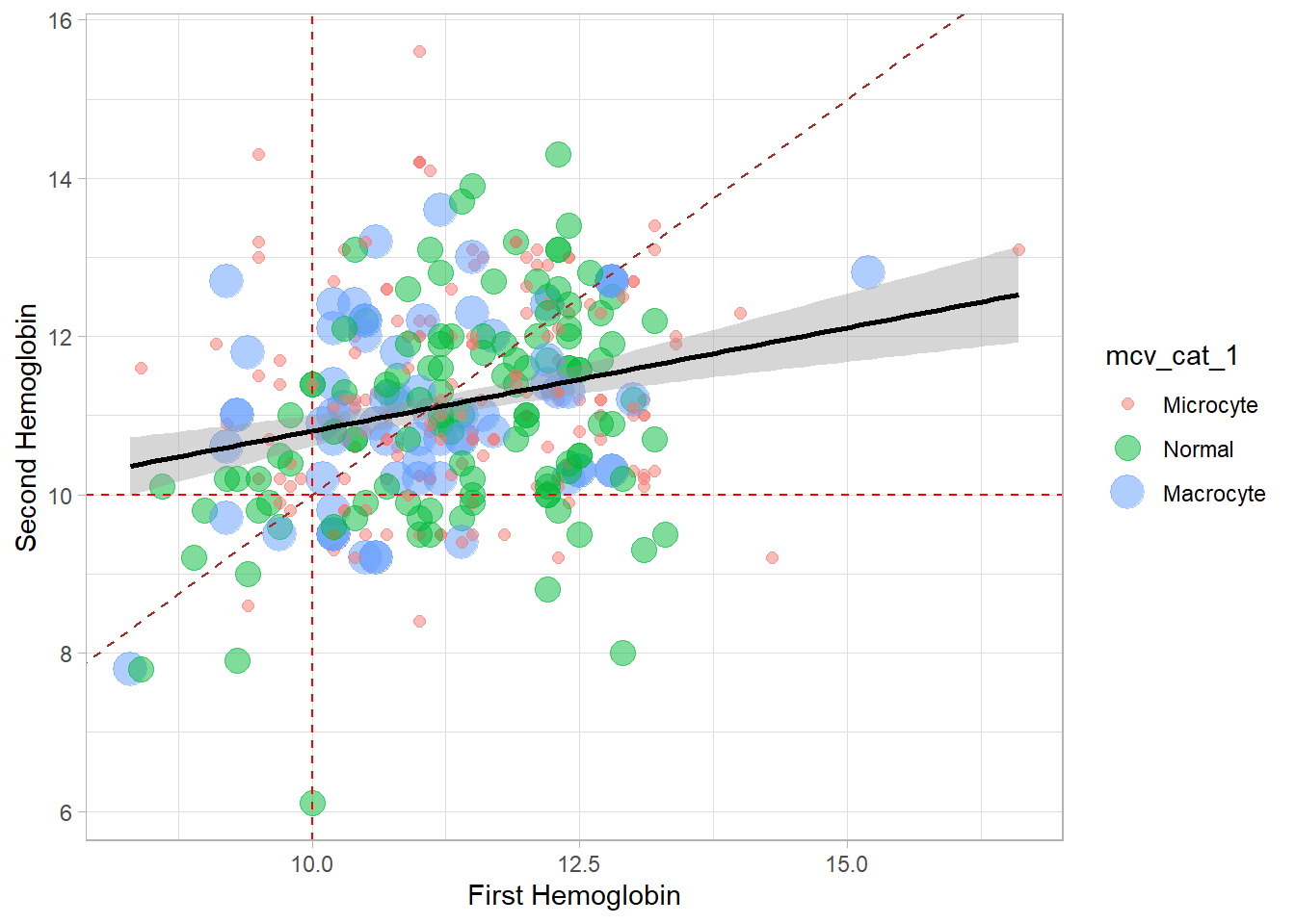
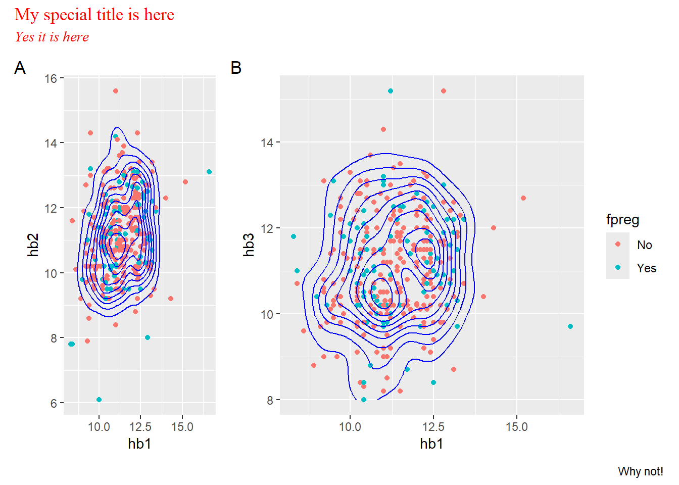
Figure 63.10: My special scatterplot with histograms of first and secon HgB
Code
p1 <- dataF %>%ggplot(aes(x=hb1, y = hb2, col = fpreg)) +geom_point() +geom_density_2d(color ="blue")p2 <- dataF %>%ggplot(aes(x=hb1, y = hb3, col = fpreg)) +geom_point() +geom_density_2d(color ="blue")(p1 + p2) +plot_annotation(title ="My special title is here",subtitle ="Yes it is here",caption ="Why not!",theme =theme(plot.title =element_text(family ="serif", colour ="red"),plot.subtitle =element_text(family ="serif", color ="red", face ="italic")),tag_levels ="A") +plot_layout(widths =c(1, 2),guides ="collect")
Figure 63.11: Combining plots
Code
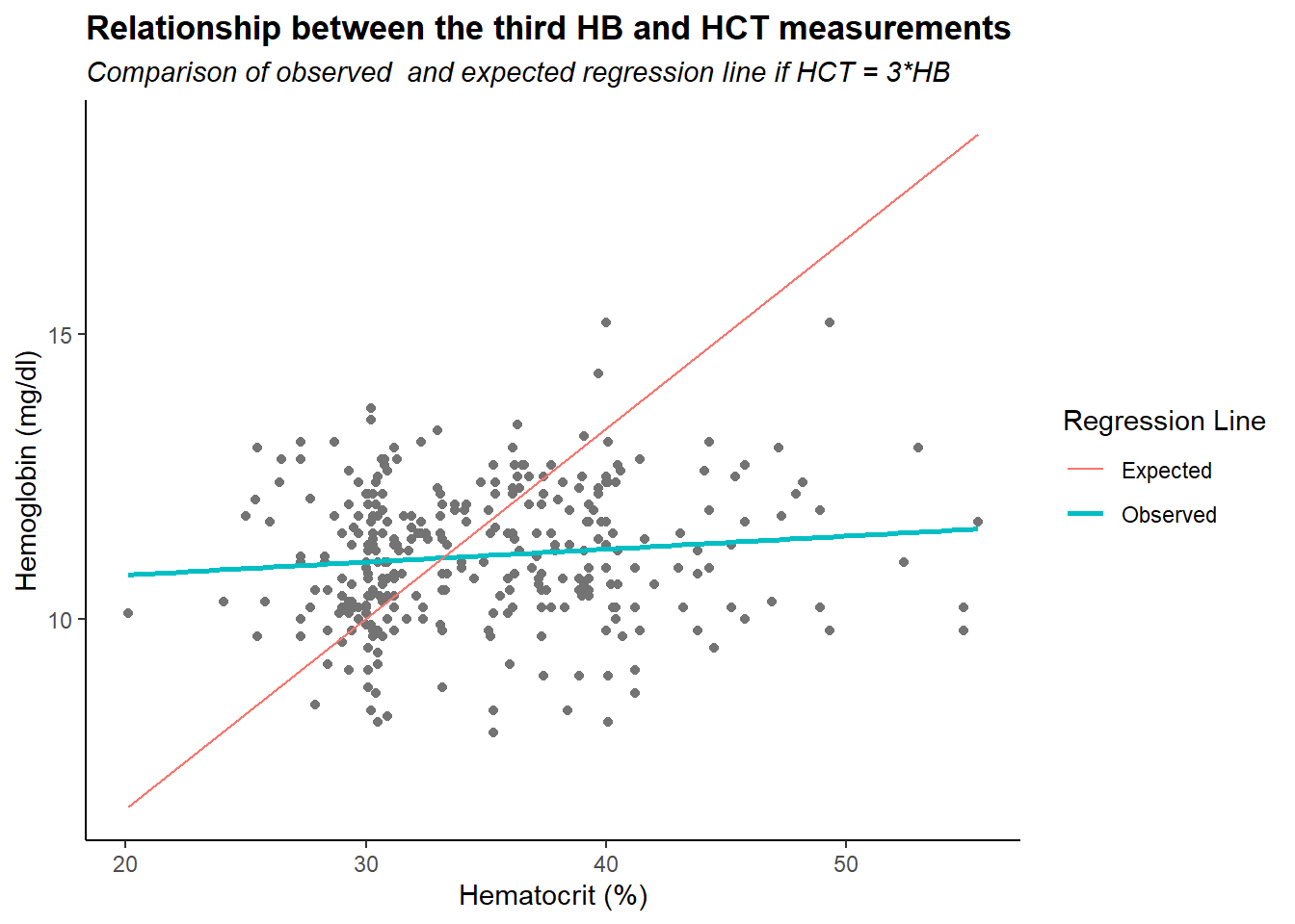
dataF %>%mutate(hct3 =ifelse(hct3 <20, hct3 +40, hct3),hct3 =ifelse(hct3 >60, hct3 -20, hct3)) %>%ggplot(aes(x = hct3, y = hb3)) +geom_point(color ="grey45") +geom_smooth(aes(x = hct3, y = hb3, col ="Observed"), formula = y~x, method ="lm", se = F) +geom_segment(aes(x =min(hct3), y =min(hct3/3), xend =max(hct3), yend =max(hct3/3), col ="Expected"))+labs(title ="Relationship between the third HB and HCT measurements",subtitle ="Comparison of observed and expected regression line if HCT = 3*HB",x ="Hematocrit (%)", y ="Hemoglobin (mg/dl)", color ="Regression Line") +theme_classic()+theme(plot.title =element_text(face ="bold"),plot.subtitle =element_text(face ="italic"))
Warning in geom_segment(aes(x = min(hct3), y = min(hct3/3), xend = max(hct3), : All aesthetics have length 1, but the data has 350 rows.
ℹ Please consider using `annotate()` or provide this layer with data containing
  a single row.
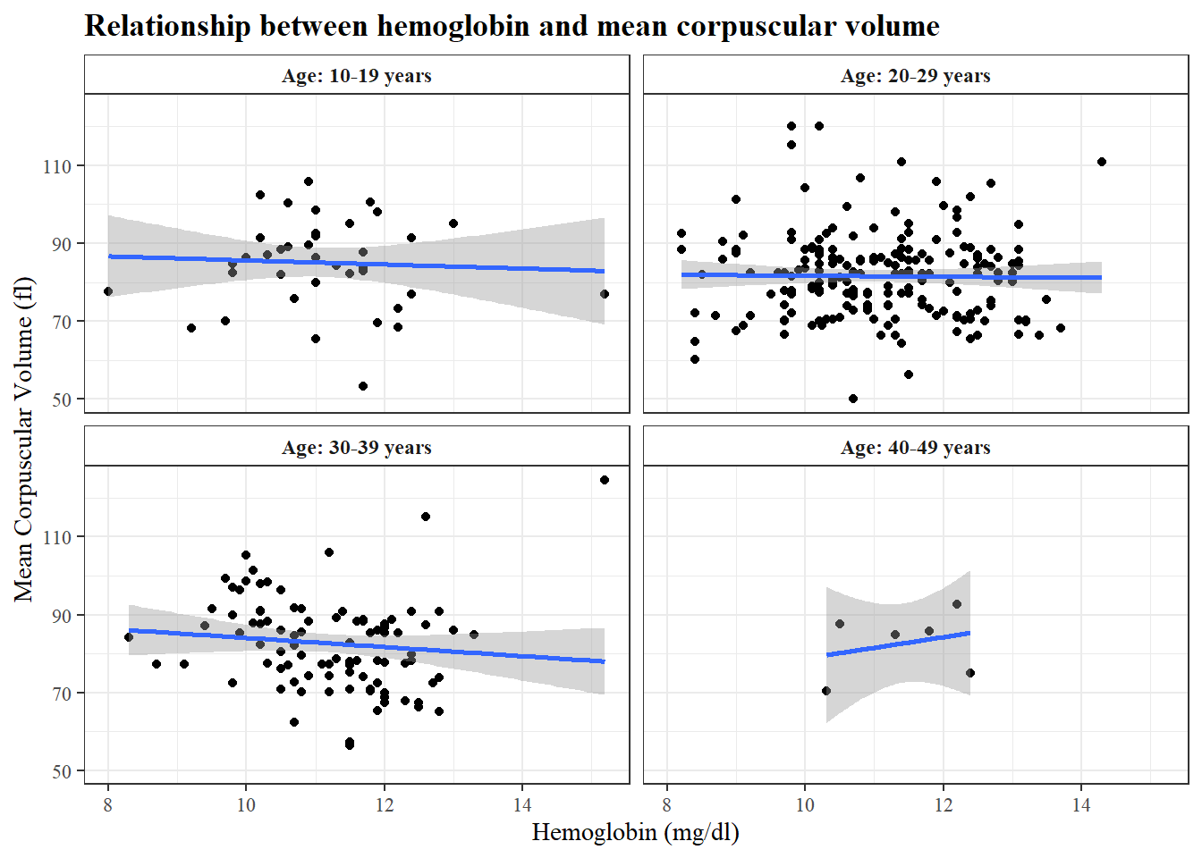
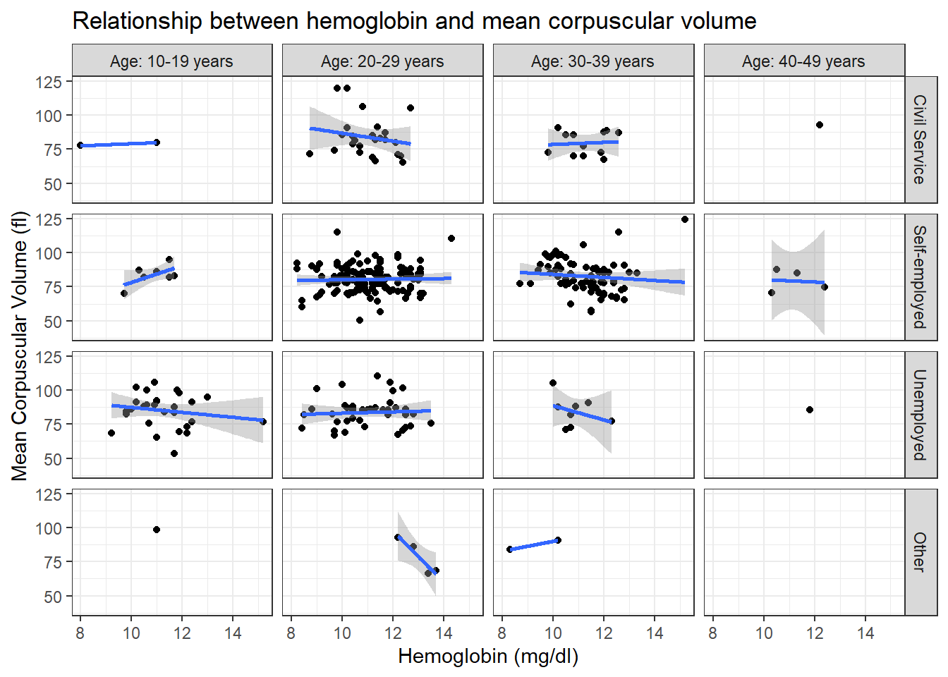
dataF %>%ggplot(aes(hb3, mcv3), size =0.5) +geom_point() +geom_smooth(method ="lm", formula = y~x) +labs(title ="Relationship between hemoglobin and mean corpuscular volume",x ="Hemoglobin (mg/dl)",y ="Mean Corpuscular Volume (fl)")+theme_bw() +facet_grid(occup ~ agecat, labeller =labeller(agecat = agecat_label))
Warning in qt((1 - level)/2, df): NaNs produced
Warning in qt((1 - level)/2, df): NaNs produced
Warning in max(ids, na.rm = TRUE): no non-missing arguments to max; returning
-Inf
Warning in max(ids, na.rm = TRUE): no non-missing arguments to max; returning
-Inf
Code
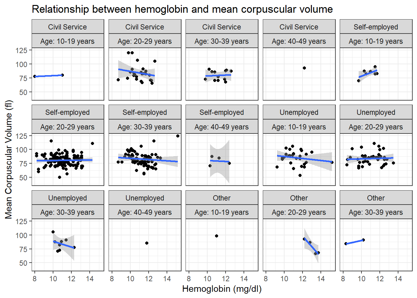
dataF %>%ggplot(aes(hb3, mcv3), size =0.5) +geom_point() +geom_smooth(method ="lm", formula = y~x) +labs(title ="Relationship between hemoglobin and mean corpuscular volume",x ="Hemoglobin (mg/dl)",y ="Mean Corpuscular Volume (fl)")+theme_bw() +facet_wrap(c("occup", "agecat"), nrow =3, labeller =labeller(agecat = agecat_label))
Warning in qt((1 - level)/2, df): NaNs produced
Warning in qt((1 - level)/2, df): NaNs produced
Warning in max(ids, na.rm = TRUE): no non-missing arguments to max; returning
-Inf
Warning in max(ids, na.rm = TRUE): no non-missing arguments to max; returning
-Inf
Code
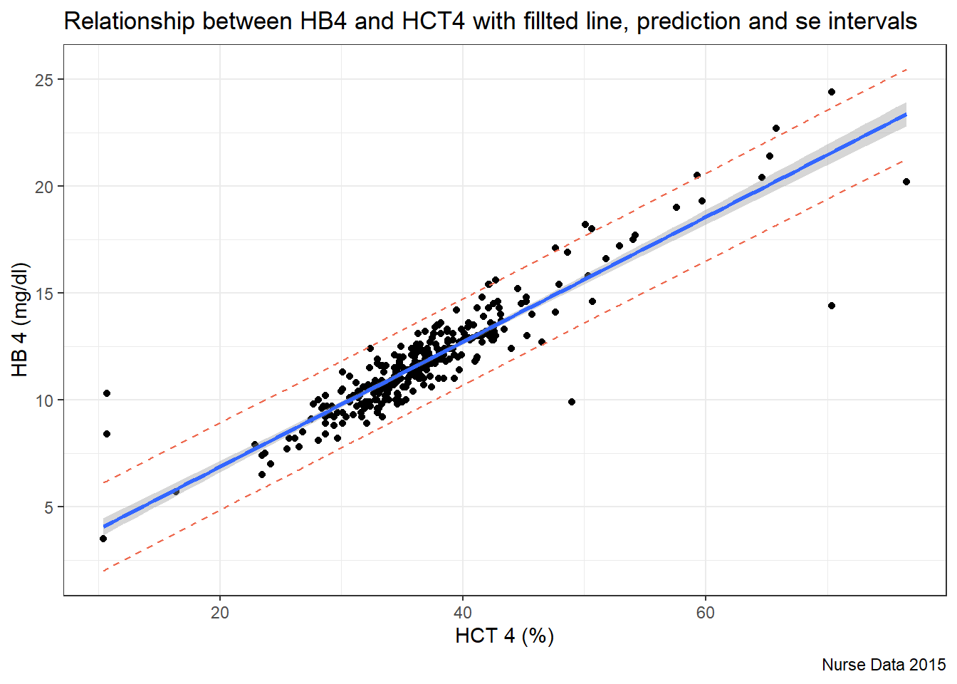
dataLM <- dataF %>%select(hct4, hb4)lm(hb4 ~ hct4, data = dataLM) %>%predict(interval ="predict") %>%as_tibble() %>%bind_cols(dataLM) %>%ggplot(aes(x = hct4, y = hb4)) +geom_point() +geom_smooth(method ="lm", formula = y~x, se=T)+geom_line(aes(y = lwr), col ="coral2", linetype ="dashed") +geom_line(aes(y = upr), col ="coral2", linetype ="dashed") +labs(title ="Relationship between HB4 and HCT4 with fillted line, prediction and se intervals",x ="HCT 4 (%)", y ="HB 4 (mg/dl)", caption ="Nurse Data 2015")+theme_bw()
Warning in predict.lm(., interval = "predict"): predictions on current data refer to _future_ responses
Code
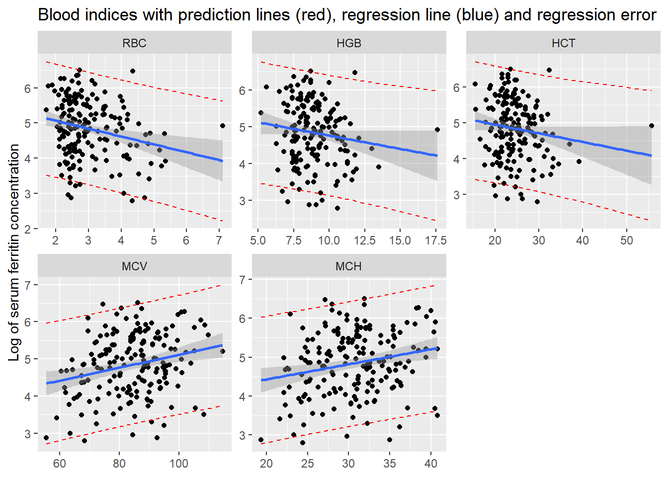
dataH <- readxl::read_xlsx("C:/Dataset/Red cell indices against ferritin.xlsx" ) %>%mutate(lg.fer =log(Ferritin), MCH =ifelse(is.na(MCH), median(MCH, na.rm=T), MCH) )preds <-rbind(predict(lm(lg.fer ~ RBC, data = dataH), interval ="prediction"),predict(lm(lg.fer ~ HGB, data = dataH), interval ="prediction"), predict(lm(lg.fer ~ HCT, data = dataH), interval ="prediction"),predict(lm(lg.fer ~ MCV, data = dataH), interval ="prediction"), predict(lm(lg.fer ~ MCH, data = dataH), interval ="prediction") ) %>%as_tibble()
Warning in predict.lm(lm(lg.fer ~ RBC, data = dataH), interval = "prediction"): predictions on current data refer to _future_ responses
Warning in predict.lm(lm(lg.fer ~ HGB, data = dataH), interval = "prediction"): predictions on current data refer to _future_ responses
Warning in predict.lm(lm(lg.fer ~ HCT, data = dataH), interval = "prediction"): predictions on current data refer to _future_ responses
Warning in predict.lm(lm(lg.fer ~ MCV, data = dataH), interval = "prediction"): predictions on current data refer to _future_ responses
Warning in predict.lm(lm(lg.fer ~ MCH, data = dataH), interval = "prediction"): predictions on current data refer to _future_ responses
Code
dataH %>%pivot_longer(cols=RBC:MCH, names_to ="bld.ind") %>%mutate(bld.ind =factor(bld.ind, levels =c("RBC", "HGB", "HCT", "MCV", "MCH")) ) %>%arrange(bld.ind) %>%bind_cols(preds) %>%ggplot(aes(x = value)) +geom_point(aes(y = lg.fer)) +geom_smooth(aes(y = lg.fer), se=T, method ="lm", formula = y~x) +geom_line(aes(y = upr), col ="red", linetype ="dashed") +geom_line(aes(y = lwr), col ="red", linetype ="dashed") +facet_wrap(vars(bld.ind), nrow =2, scales ="free") +labs(title ="Blood indices with prediction lines (red), regression line (blue) and regression error",y ="Log of serum ferritin concentration",x =NULL)