Code
df <-
  data.frame(
      dose = c("D0.5", "D1", "D2"),
      len = c(4.2, 10, 29.5))
df
dose len
1 D0.5 4.2
2 D1 10.0
3 D2 29.5To start, we create fictitious data
df <-
data.frame(
dose = c("D0.5", "D1", "D2"),
len = c(4.2, 10, 29.5))
df dose len
1 D0.5 4.2
2 D1 10.0
3 D2 29.5Next, we make the basic Barplot
p <-
  df %>%
  ggplot(aes(x = dose, y = len))

p +
    geom_bar(stat = "identity")+
    labs(
        x = "Dose (mg)",
        y = 'Tooth Length (mm)',
        title = "Distribution of Tooth Lenghts for the variuos dosee")+
    theme_classic()+
    coord_cartesian(expand = FALSE)
Next we flip the barplot horizontal, change the size of the bar width and change the theme
p +
  geom_bar(
      stat = "identity",
      width = 0.8,
      color = "blue",
      fill = "grey90") +
  coord_flip() +
  theme_bw()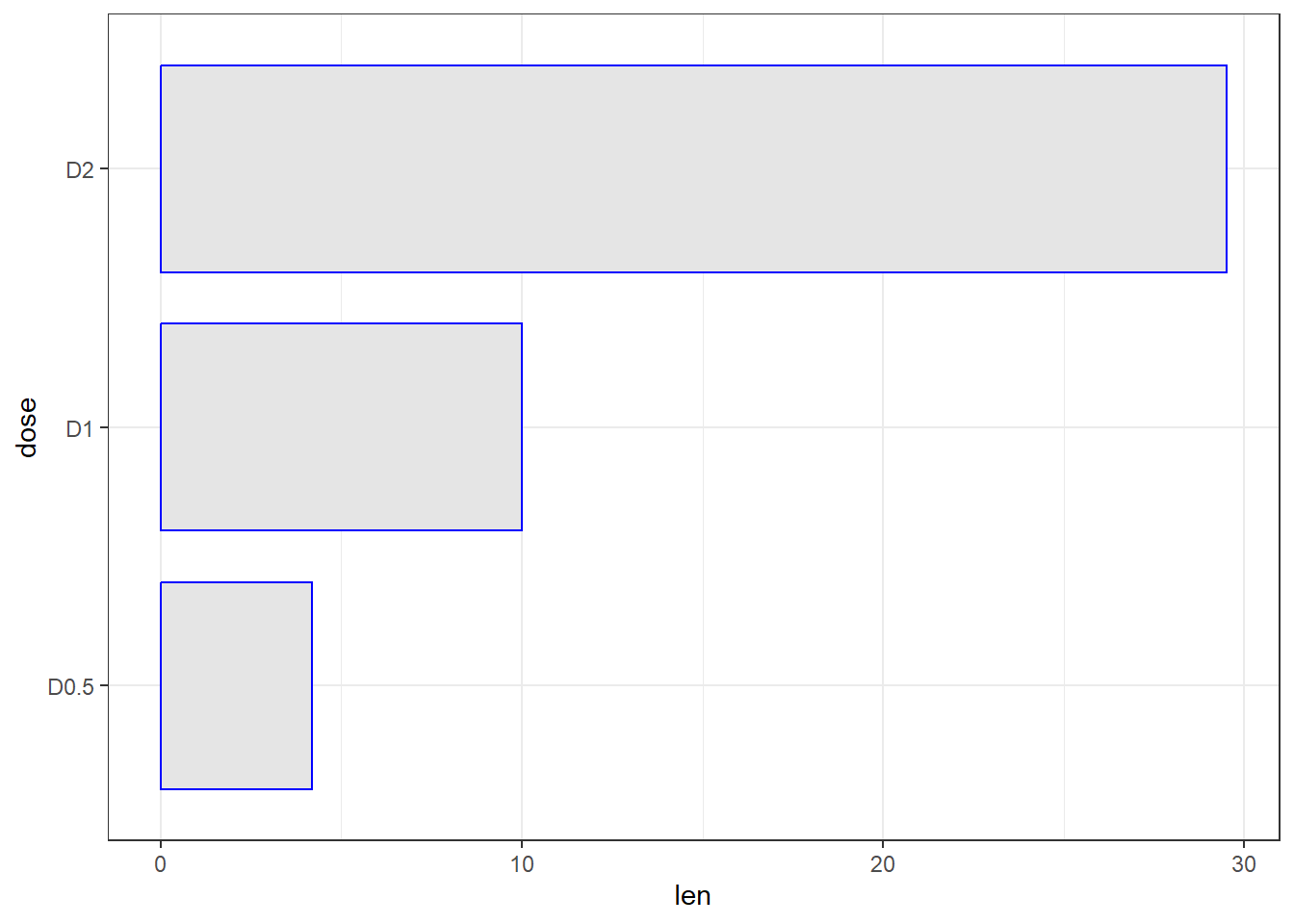
Next we limit the observations to just two
p +
  geom_bar(
      stat = "identity",
      width = 0.8,
      color = "black",
      fill = "steelblue") +
  scale_x_discrete(limits=c("D0.5", "D2"))
Warning: Removed 1 row containing missing values or values outside the scale range
(`geom_bar()`).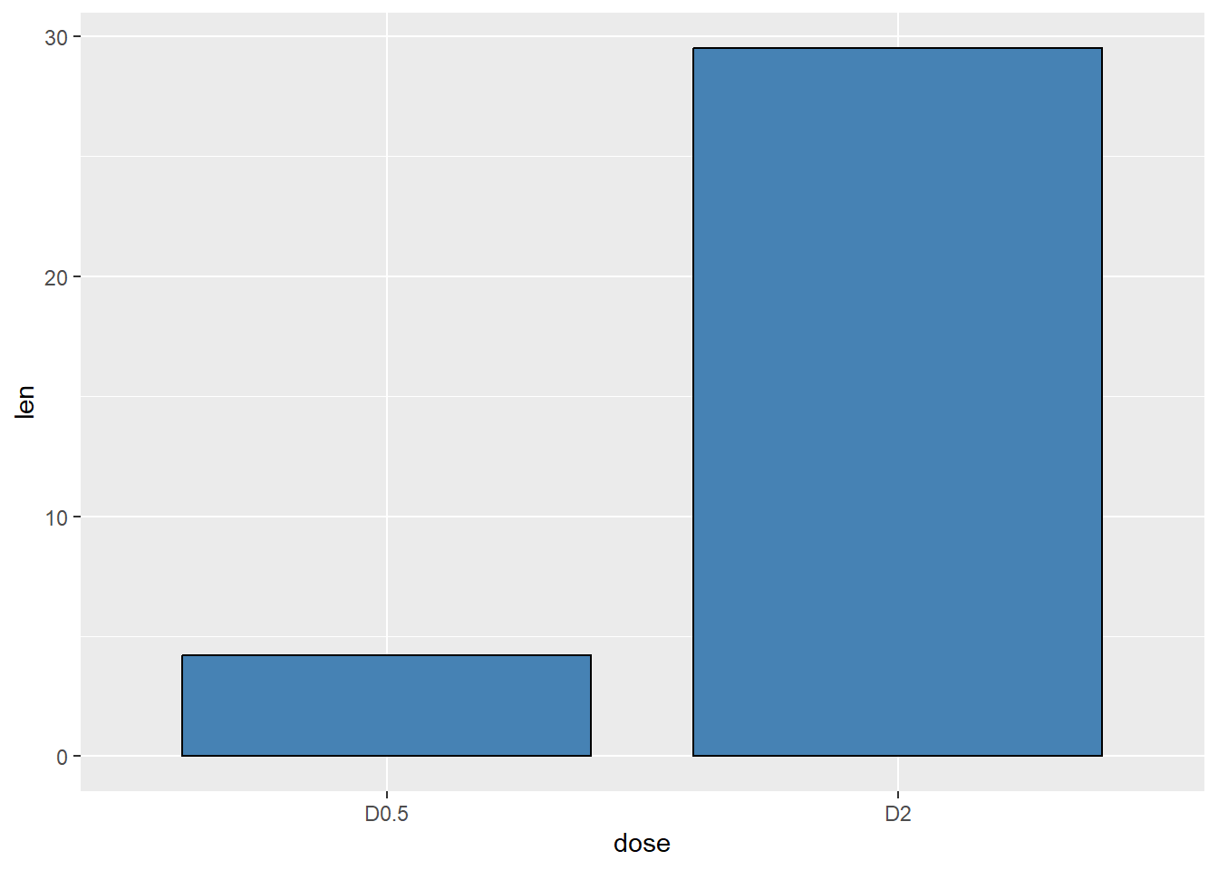
Next we put labels on the bars at the outside and inside
p +
    geom_bar(stat = "identity", fill = "steelblue")+
    geom_text(aes(label=len), vjust=-0.5, size = 4, col = "black")+
    theme_minimal()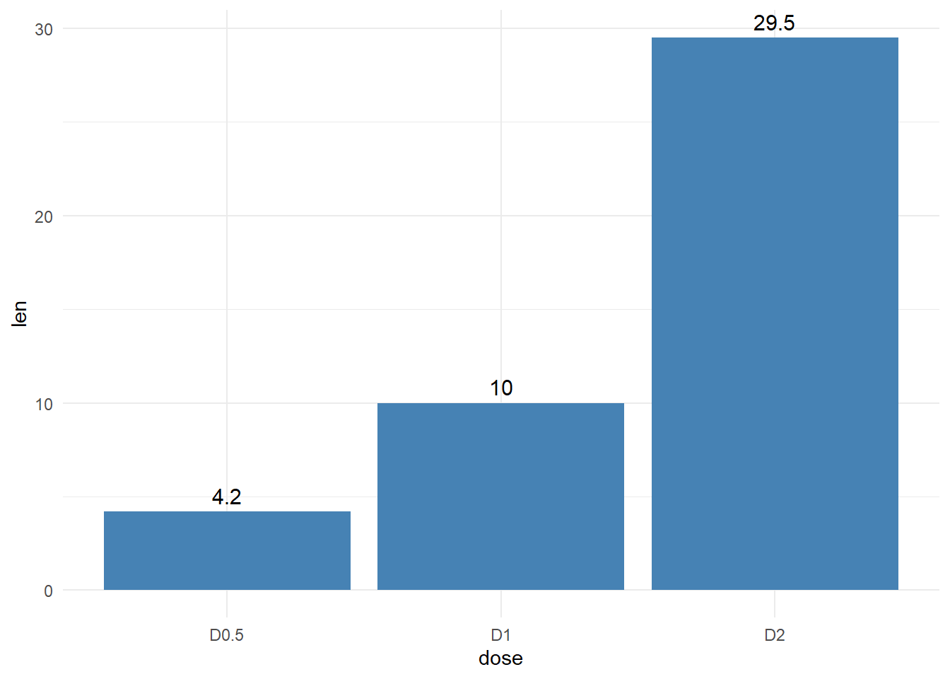
# Change barplot line colors by groups
p <-
    ggplot(df, aes(x = dose, y = len, color = dose)) +
    geom_bar(stat = "identity", fill = "white") +
    geom_text(aes(label=len), vjust=1.5, size=5, col = "red")
p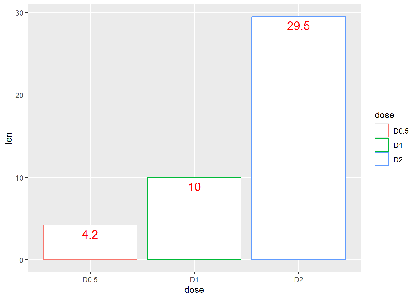
p + scale_color_manual(values=c("#999999", "#E69F00", "#56B4E9"))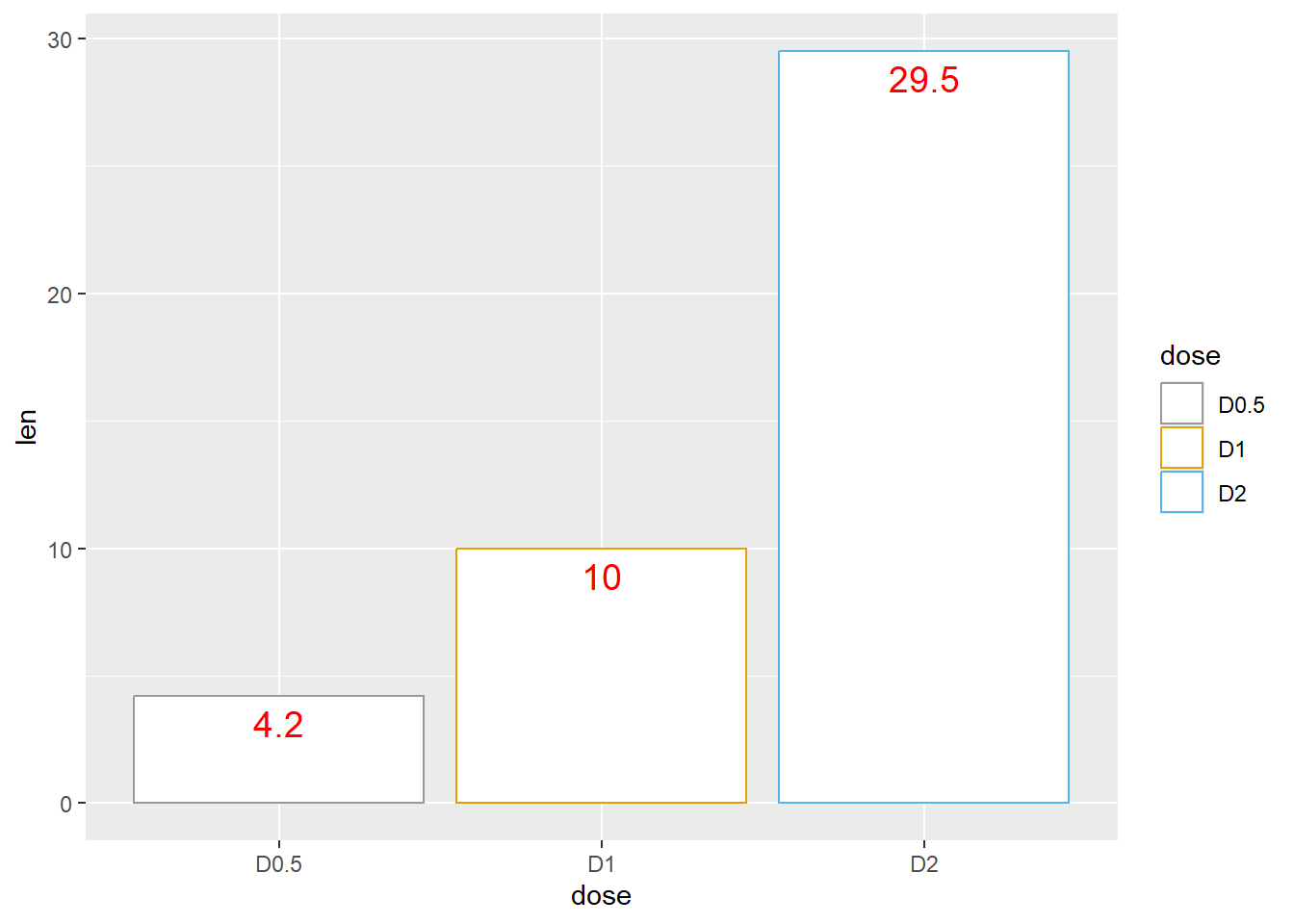
Use brewer color palettes
p + scale_color_brewer(palette="Dark2")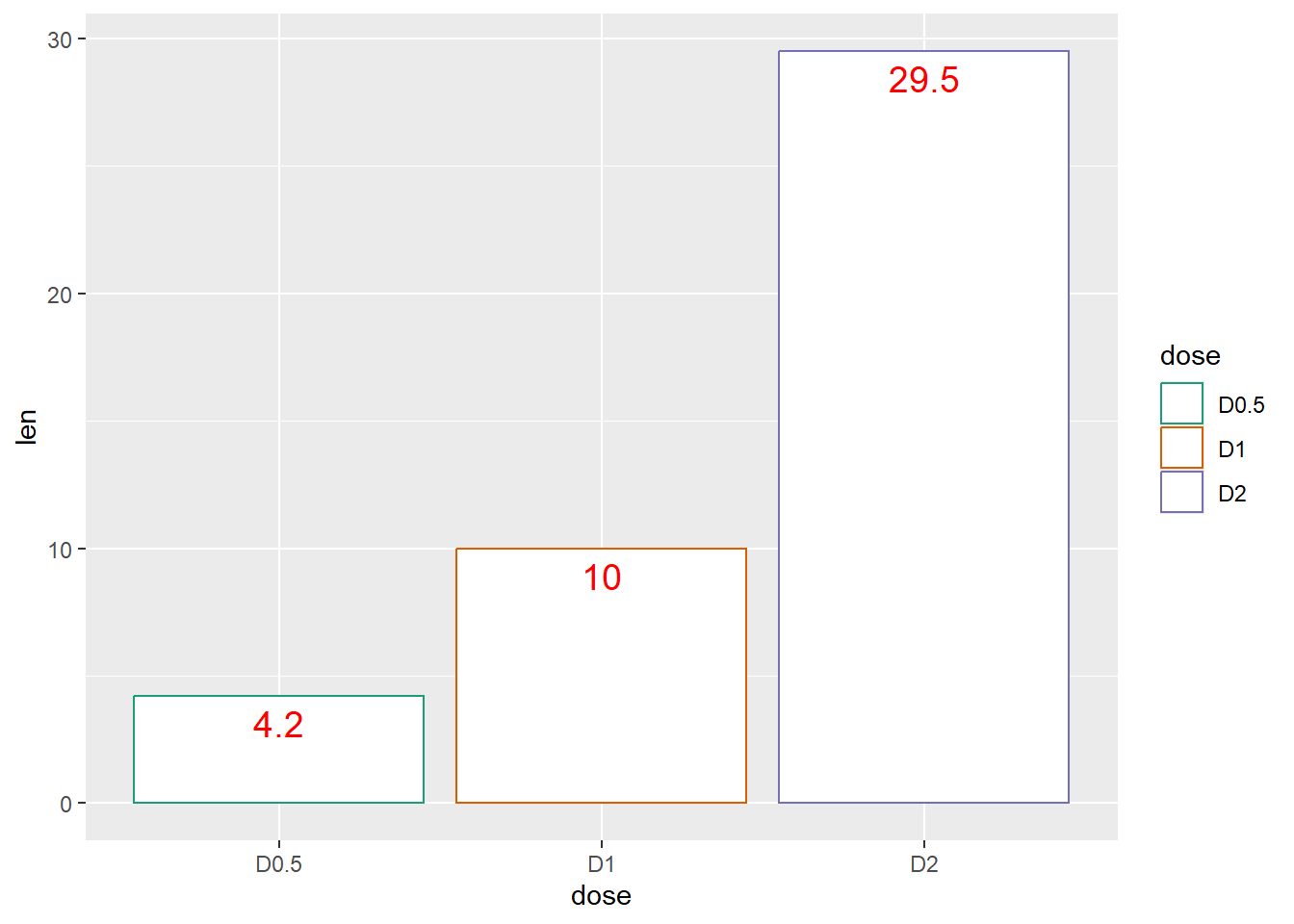
p + scale_color_grey() + theme_classic()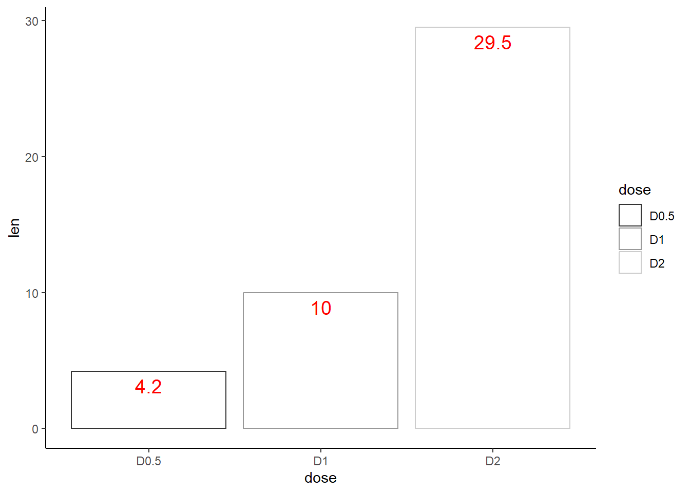
Change barplot fill colors by groups
#
p <-
  ggplot(df, aes(x=dose, y=len, fill=dose)) +
  geom_bar(stat="identity")+theme_minimal()
p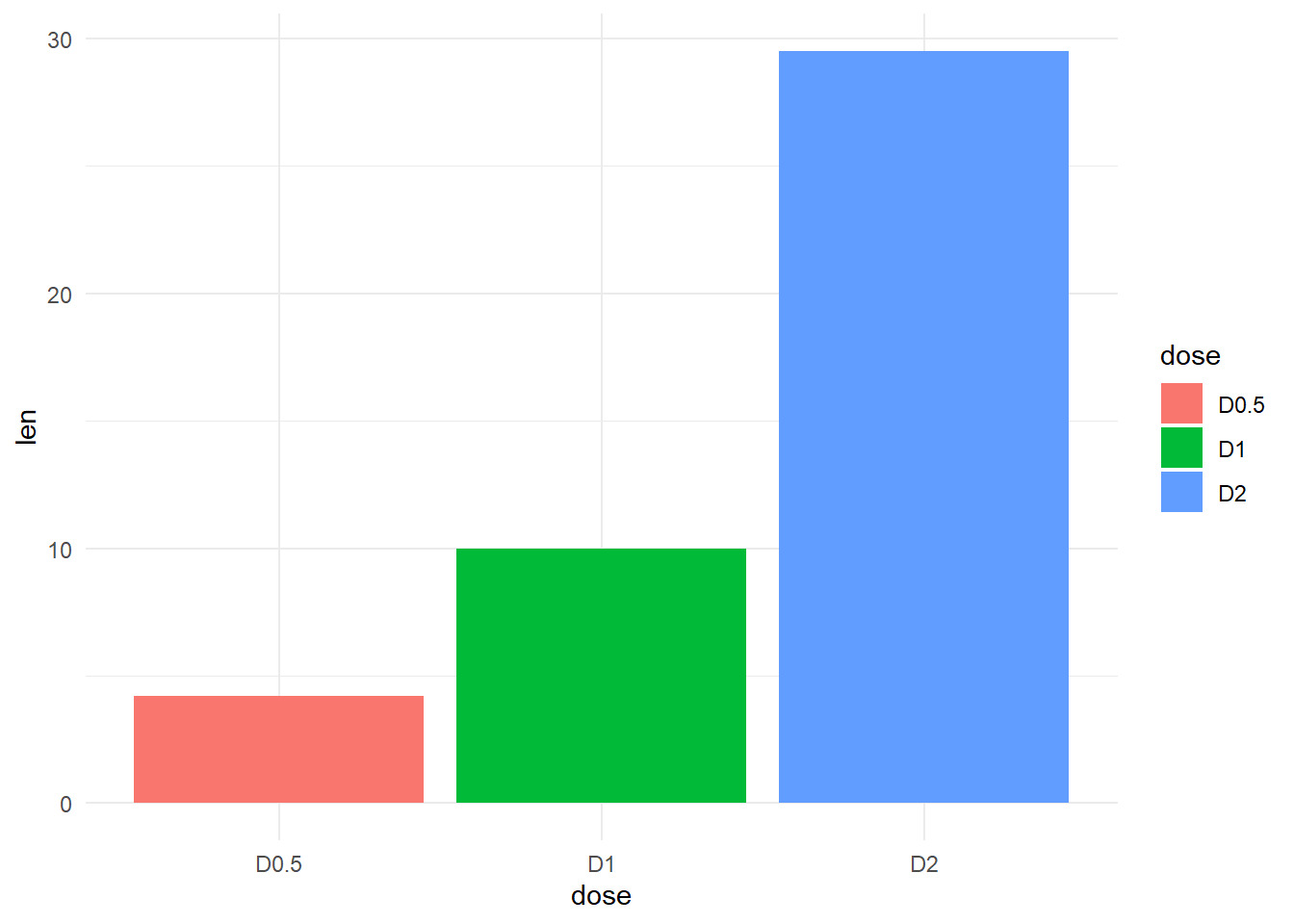
Use custom color palettes
p +
    scale_fill_manual(values=c("#999999", "#E69F00", "#56B4E9"))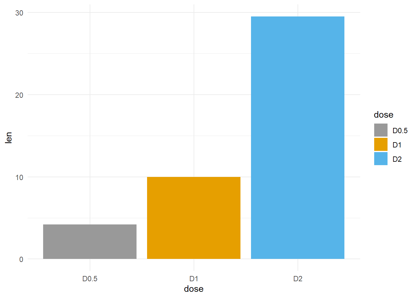
p +
  scale_fill_brewer(palette="Dark2")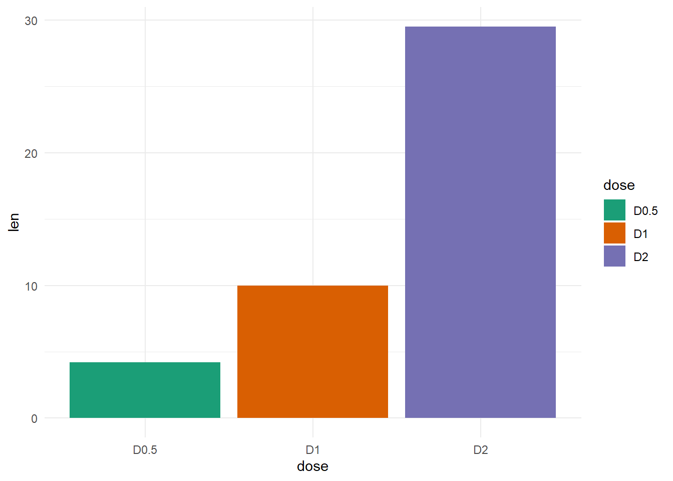
Use grey scale
p + scale_fill_grey()
ggplot(df, aes(x=dose, y=len, fill=dose))+
    geom_bar(stat="identity", color="black")+
    scale_fill_manual(values=c("#999999", "#E69F00", "#56B4E9"))+
  theme_minimal()
Change bar fill colors to blues
p +
    scale_fill_brewer(palette = "Blues") +
    labs(
        fill = NULL,
        y = "Length (cm)")+
    theme(
        legend.position = "inside",
        legend.position.inside = c(0.2,.8),
        legend.direction = "horizontal",
        legend.background = element_rect(color = "gray45"))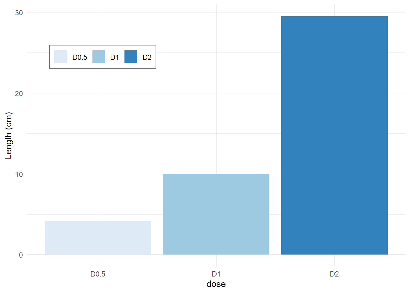
Change position of bars
p +
  scale_x_discrete(limits=c("D2", "D0.5", "D1"))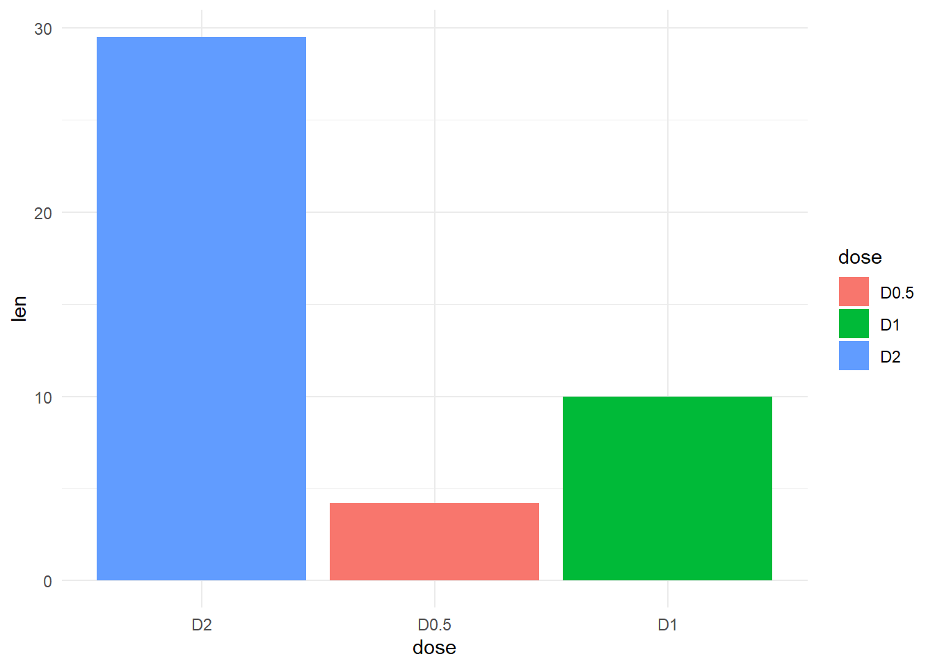
dat <- foreign::read.dta("C:/dataset/bea_organ_damage_28122013.dta")
BC <-
  dat %>%
  select(q2idtype, q3sex) %>%
  na.omit() %>%
  group_by(q2idtype, q3sex) %>%
  summarize(Freq = n()) %>%
  ggplot(aes(x=q2idtype, y=Freq, fill=q3sex))
`summarise()` has grouped output by 'q2idtype'. You can override using the
`.groups` argument.Next we draw the barplot using the economist theme from the ggthemes package
BC +
  geom_bar(stat="identity", position= position_dodge()) +
    geom_text(aes(label=Freq), vjust=1.6, color="black",
              size=4, position = position_dodge(0.9)) +
    scale_fill_brewer(palette="Reds") +
    labs(title="My Barplot", x="Case or Control", y="Frequency") +
    scale_color_discrete(name="Sex") +
    ggthemes::theme_stata()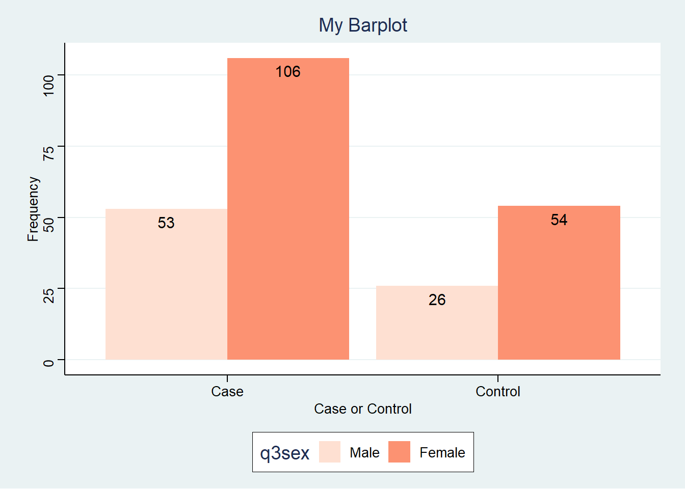
Next we plot a baroplot with error bars. To do that we first we form the ggplot object that we call BC.
BC <-
  dat %>%
  select(Type = q2idtype, Sex = q3sex, q12weight) %>%
  na.omit() %>%
  group_by(Type, Sex) %>%
  summarize(Mean.wgt = mean(q12weight), SD.wgt = sd(q12weight)) %>%
  ggplot(aes(x=Type, y=Mean.wgt, fill=Sex))
`summarise()` has grouped output by 'Type'. You can override using the
`.groups` argument.And then plot the graph
BC +
    geom_bar(stat="identity", position=position_dodge()) +
    geom_errorbar(
        aes(ymin = Mean.wgt-SD.wgt, ymax = Mean.wgt+SD.wgt),
        width=.2,
        size=0.,
        position=position_dodge(.9)) +
    labs(
        title="Mean weight with error bars",
        x="Case or Control",
        y="Mean(kgs)") +
    scale_fill_brewer(palette="Paired") +
    ggthemes::theme_stata()
Warning: Using `size` aesthetic for lines was deprecated in ggplot2 3.4.0.
ℹ Please use `linewidth` instead.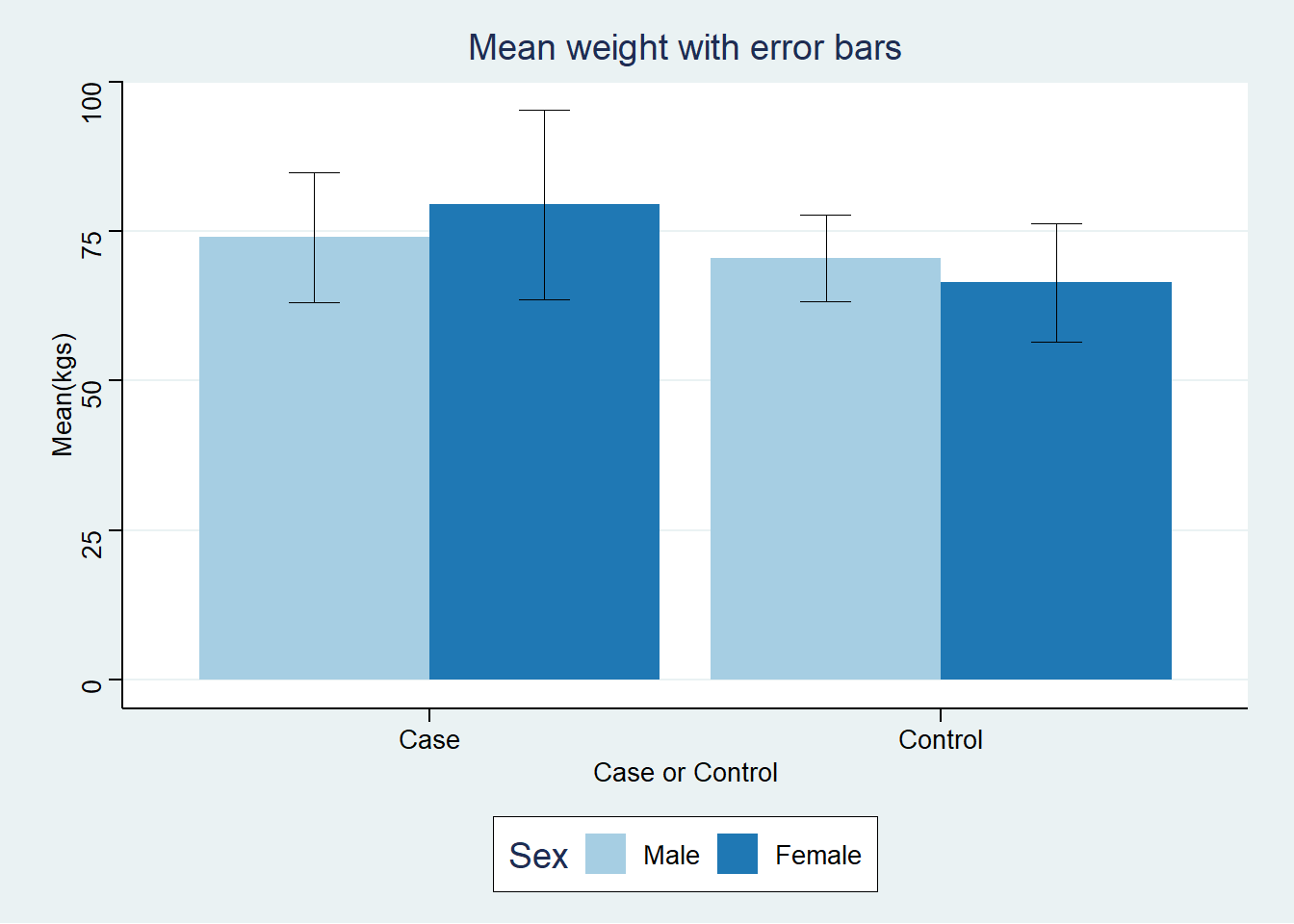
df2 <- data.frame(supp=rep(c("VC", "OJ"), each=3),
                dose=rep(c("D0.5", "D1", "D2"),2),
                len=c(6.8, 15, 33, 4.2, 10, 29.5))
head(df2)
TRUE supp dose len
TRUE 1 VC D0.5 6.8
TRUE 2 VC D1 15.0
TRUE 3 VC D2 33.0
TRUE 4 OJ D0.5 4.2
TRUE 5 OJ D1 10.0
TRUE 6 OJ D2 29.5df2 %>%
ggplot(aes(x=dose, y=len, fill=supp)) +
geom_bar(stat="identity")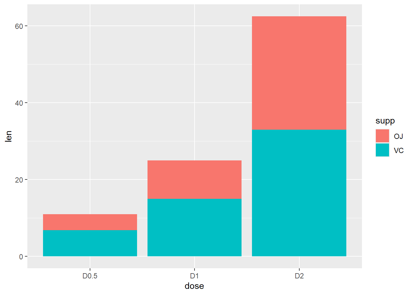
df2 %>%
  ggplot(aes(x=dose, y=len, fill=supp)) +
  geom_bar(stat="identity", position=position_dodge())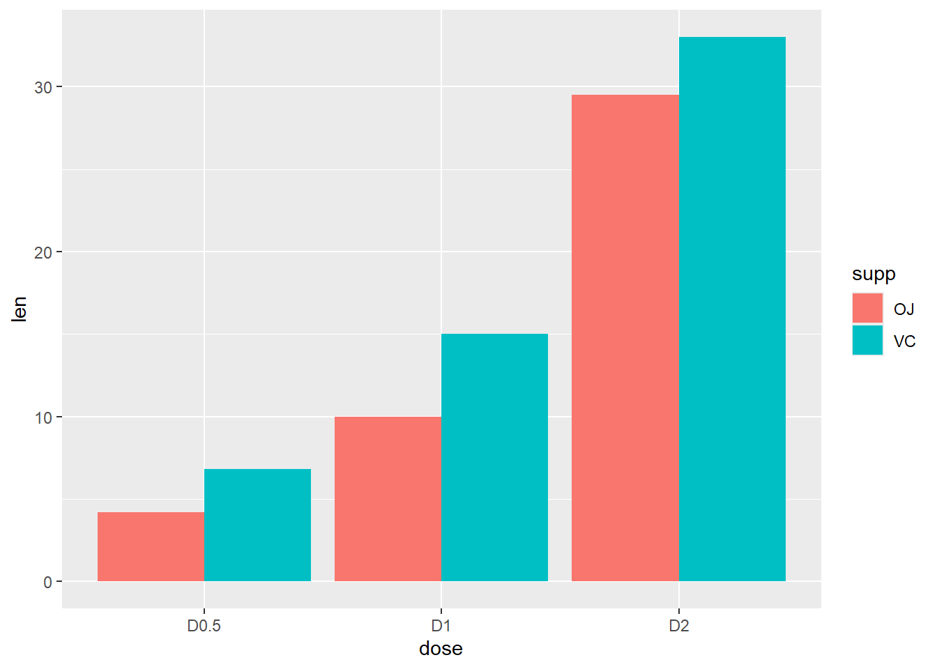
Change color manually
p <-
  ggplot(data=df2, aes(x=dose, y=len, fill=supp)) +
  geom_bar(stat="identity", color="black", position=position_dodge()) +
  scale_fill_manual(values=c('#999999','#E69F00')) +
  theme_minimal()
p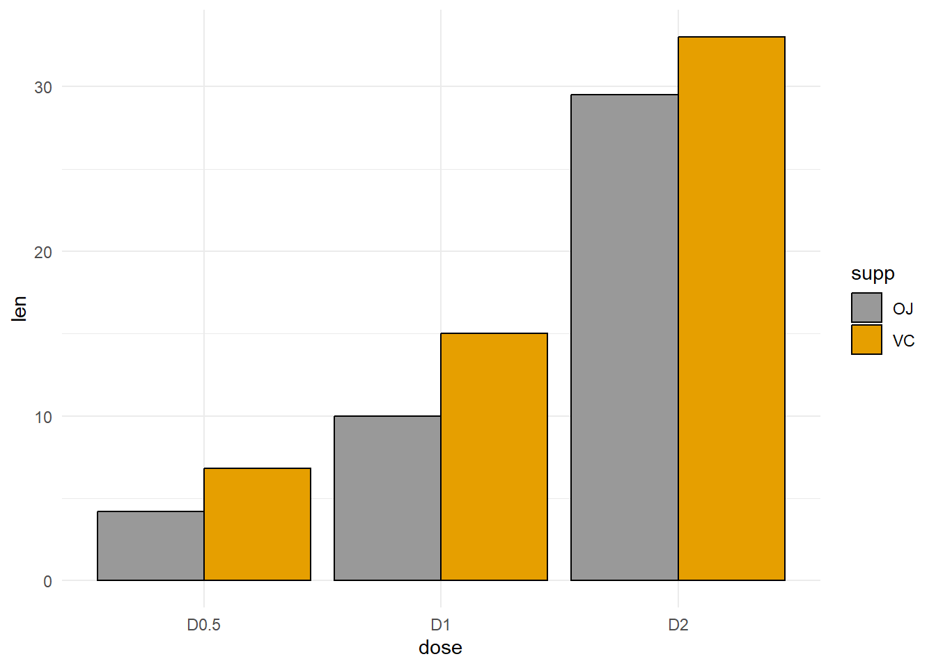
Create some data
df_sorted <-
  tibble(supp = factor(rep(c("VC", "OJ"), each=3)),
         dose = rep(c("0.5", "1", "2"),2),
         len = c(6.8, 15, 33, 4.2, 10, 29.5)) %>%
  arrange(dose, supp) %>%
  group_by(dose) %>%
  mutate(label_ypos=cumsum(len))
df_sorted
# A tibble: 6 × 4
# Groups: dose [3]
supp dose len label_ypos
<fct> <chr> <dbl> <dbl>
1 OJ 0.5 4.2 4.2
2 VC 0.5 6.8 11
3 OJ 1 10 10
4 VC 1 15 25
5 OJ 2 29.5 29.5
6 VC 2 33 62.5df_sorted %>%
ggplot(aes(x=dose, y=len, fill=supp)) +
geom_bar(stat="identity")+
geom_text(aes(y=label_ypos, label=len), vjust=1.6,
color="white", size=3.5)+
scale_fill_brewer(palette="Paired")+
theme_minimal()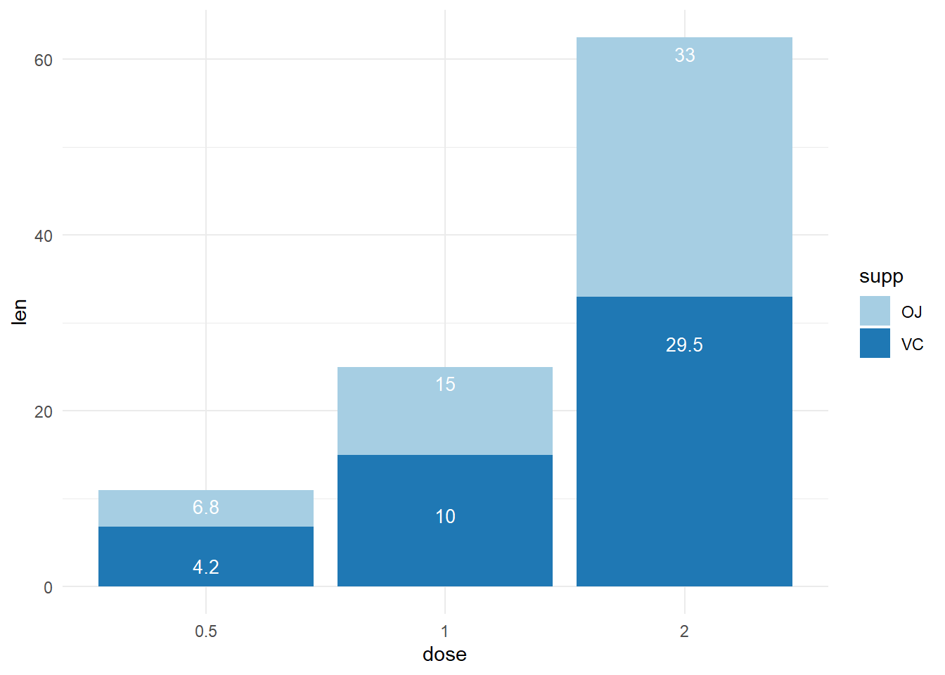
Plotting barplot with x-axis treated as continuous variable
#
df_sorted %>%
  mutate(dose = as.numeric(dose)) %>%
  ggplot(aes(x=dose, y=len, fill=supp)) +
  geom_bar(stat="identity", position=position_dodge())+
  scale_fill_brewer(palette="Paired")+
  theme_minimal()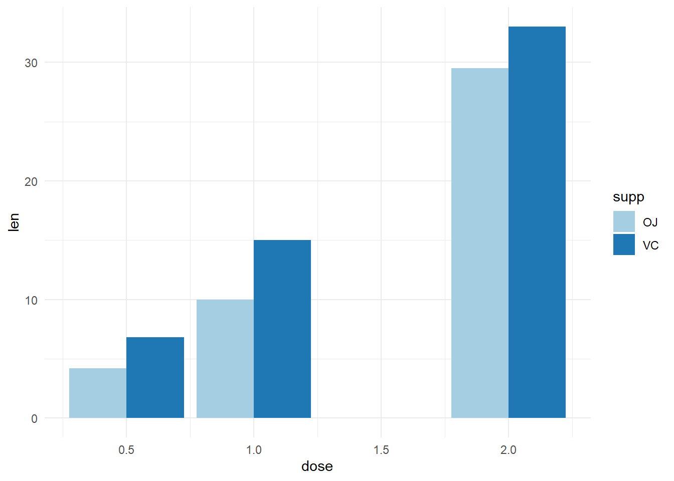
# Axis treated as discrete variable
df_sorted %>%
  mutate(dose = as.factor(dose)) %>%
  ggplot(aes(x=dose, y=len, fill=supp)) +
  geom_bar(stat="identity", position=position_dodge())+
  scale_fill_brewer(palette="Paired")+
  theme_minimal()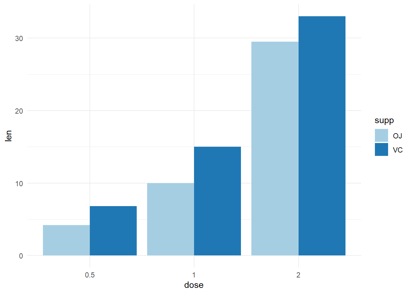
ToothGrowth %>%
  mutate(dose = as.factor(dose)) %>%
  group_by(supp, dose) %>%
  summarise(sd = sd(len), len = mean(len), .groups = "drop") %>%
  ggplot(aes(x=dose, y=len, fill=supp)) +
  geom_bar(stat="identity", position=position_dodge()) +
  geom_errorbar(aes(ymin=len-sd, ymax=len+sd), width=.2,
                position=position_dodge(.9)) +
  labs(title="Plot of length  per dose", x="Dose (mg)", y = "Length")+
  scale_fill_brewer(palette="Paired") +
  theme_minimal()
babies <-
    dget("babies_clean") %>%
    select(apgar5cat, died)

babies %>%
    ggplot(aes(x = apgar5cat, fill = apgar5cat)) +
    geom_bar(stat = 'count') +
    scale_fill_grey(
        name = "APGAR Category",
        label = c("LOW", "MEDIUM", "HIGH"))+
    theme_bw()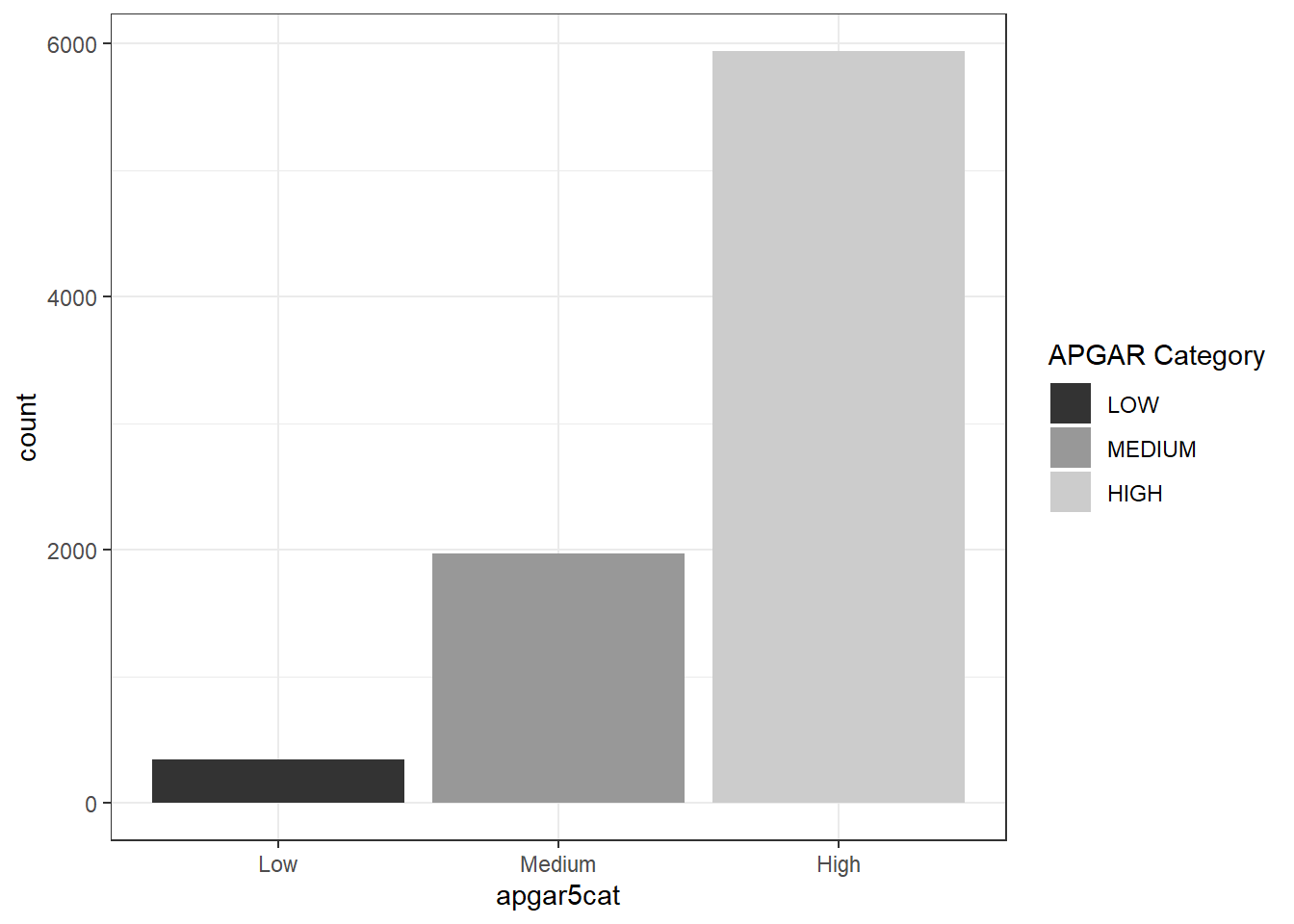
Graph of binomial confiedence intervals
tibble(
    alg = c(
        "D farina", "D pteronyssinus", "American Cockroach",
        "Dog","Alternaria","Rye grass"),
    n = c(125, 118, 62, 3, 3, 0)) %>%
    mutate(N = rep(161, 6)) %>%
    mutate(xx = epiDisplay::ci.binomial(n, N)) %>%
    unnest(xx) %>%
    ggplot(
        aes(
            x = alg, y = probability, color = alg,
            ymin = exact.lower95ci, ymax = exact.upper95ci)) +
    geom_col(
        fill = "steelblue",
        color = "steelblue", alpha = 0.4) +
    geom_errorbar(color = "steelblue",  width = 0.15)+
    labs(
        y = "Percentage (%)",
        x = NULL,
        caption = "Asthma study (2023)")+
    theme_bw()+
    scale_y_continuous(br = seq(0, 1, 0.2), labels = seq(0, 100, 20))+
    theme(
       axis.text.x = element_text(
           angle = 90, hjust = 1, vjust = 0.05,
           face = "italic"))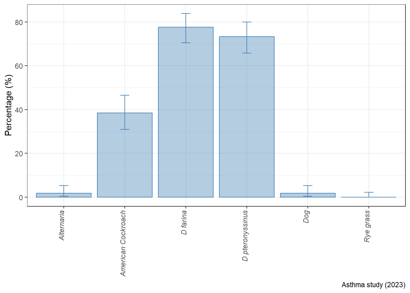
dataF %>%
    mutate(
        avehb_cat = case_when(
            avehb < median(avehb) ~ "Low HB",
            avehb >= median(avehb) ~ "High HB") %>%
            factor(levels = c("Low HB", "High HB"))) %>%
    select(starts_with("mcv"), avehb_cat) %>%
    pivot_longer(
        cols = c(mcv1:mcv5),
        values_to = "mcv",
        names_to = "measure") %>%
    group_by(avehb_cat, measure) %>%
    mutate(
        mean_mcv = mean(mcv),
        low_mcv = mean_mcv - 1.96*sd(mcv)/sqrt(n()),
        high_mcv = mean_mcv + 1.96*sd(mcv)/sqrt(n())) %>%
    ggplot(aes(y = mean_mcv, x = measure, fill = avehb_cat)) +
    geom_bar(stat = "identity", position = position_dodge(0.9)) +
    geom_errorbar(
        aes(ymin = low_mcv, ymax = high_mcv), size = 0.8,
            width = 0.3, position = position_dodge(0.9)) +
    labs(y = "Mean Corpuscular Volume",
         x = NULL,
         title = "Variation in MCV per review period (95%CI)",
         caption = "Source: Data One")+
    scale_fill_manual(name = "Hemoglobin \n Status", values = c("grey", "grey45"))+
    scale_x_discrete(
        labels = toupper(c("First", "Second", "Third", "Fourth", "Fifth")))+
    scale_y_continuous(limits = c(0,130), breaks = seq(0, 130, 10))+
    theme(
        panel.background = element_rect(colour = "black", fill = "white"),
        plot.background  = element_rect(fill = "grey"),
        plot.title = element_text(
            face = "bold", hjust = 0.5, family = "serif"),
        axis.text = element_text(face = "bold", family = "serif"),
        axis.title = element_text(family = "serif", face = "bold"),
        plot.caption = element_text(family = "serif", face = "bold"),
        legend.text = element_text(family = "serif", face = "bold"),
        legend.title = element_text(
            family = "serif", face = "bold", hjust = 0))
dataF %>%
    group_by(anemia1, agecat) %>%
    mutate(
        Anemia.1 = case_when(
            anemia1 == 0 ~ "No",
            anemia1 == 1 ~ "Yes") %>% as_factor()) %>%
    reframe(
        across(
            c(hb1,hb2),
            list(Mean = mean, SD = sd, se = ~sd(.x)/sqrt(n())))) %>%
    ggplot(aes(x = anemia1, y=hb1_Mean, fill = agecat)) +
    geom_errorbar(aes(ymin = hb1_Mean - 1.96*hb1_SD, ymax = hb1_Mean + 1.96*hb1_SD),
                  position = position_dodge(0.9), width = 0.2, size = 0.8) +
    geom_bar(
        stat = "identity", position = position_dodge(0.9), col = "black") +
    labs(
        x = "First Anemia Present", y = "Mean of First HgB (mg/dL)",
        title = "Average initial HgB for first anemia and Age Categories") +
    theme_bw()+
    scale_fill_brewer(name = "Age Group", palette = "Dark2",
                      labels= c("10-19 yrs", "20-29 yrs", "30-39 yrs", "40-49 yrs"))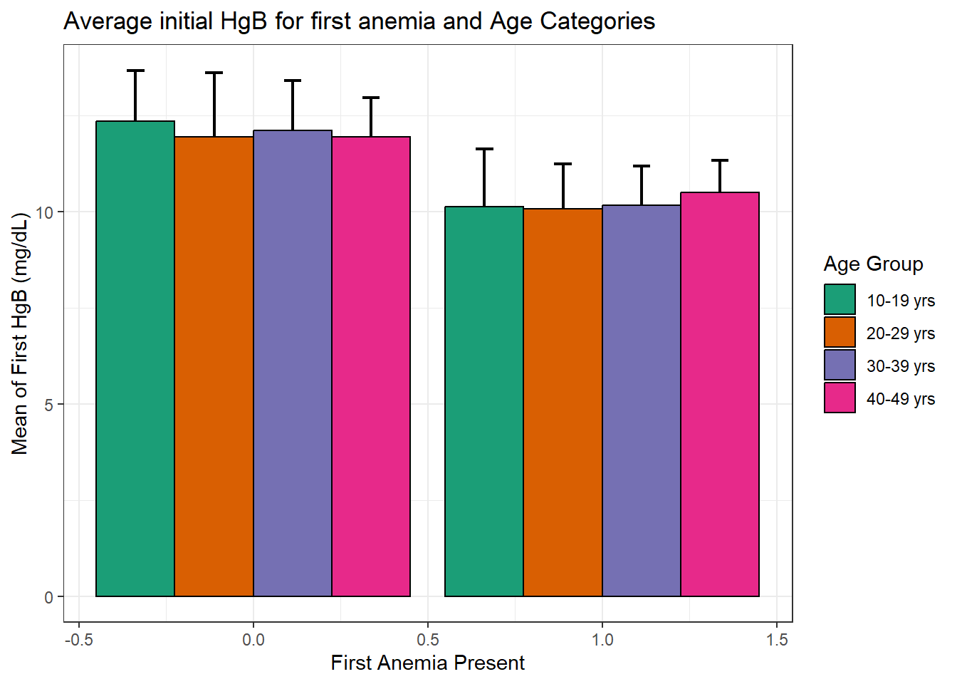
# df_sbp <-
    readxl::read_xlsx("C:/Dataset/SBPDATA.xlsx") %>%
    janitor::clean_names() %>%
    drop_na() %>%
    select(disease_class, sbp_0:sbp_18) %>%
    pivot_longer(cols = sbp_0:sbp_18) %>%
    group_by(disease_class, name) %>%
    summarize(across(value, ~epiDisplay::ci(.)), .groups = "drop") %>%
    unnest(cols = c(value)) %>%
    mutate(
        name = factor(
            name,
            levels = c(
                "sbp_0", "sbp_2", "sbp_4", "sbp_6", "sbp_8",
                "sbp_10", "sbp_12", "sbp_14", "sbp_16", "sbp_18"),
            labels = c(
                "Month Zero", "Month Two", "Month Four",
                "Month Six", "Month Eight", "Month Ten",
                "Month Twelve", "Month Fourten",
                "Month Sixteen", "Month Eighteen" )),
        disease_class = factor(
            disease_class, levels = c("DM", "HPT", "DM+HPT"))) %>%
    ggplot(aes(x = disease_class, y = mean, fill = name), col = "black") +
    geom_col(position = position_dodge(0.9), col = "gray45", alpha = 0.4)+
    geom_errorbar(aes(ymax = mean+se, ymin = mean-se),position = position_dodge(0.9), width = 0.3)+
    labs(fill = NULL, x = NULL, y = "Systolic Blood Pressure (mmHg)")+
    scale_fill_manual(
        values = c("#FF5733","#33FF57","#3357FF","#FFD700","#7D33FF",
                   "#FF33C1", "#33FFF5","#FF8C33","#8CFF33",
                   "#F533FF"))+
    scale_y_continuous(limits = c(0, 150))+
    scale_x_discrete(
            limits = c("DM", "HPT", "DM+HPT"),
            label = c(
                "Diabetes Mellitus",
                "Hypertension",
                "Diabetes mellitus and \n Hypertension"))+
    coord_cartesian(ylim = c(100, 150), expand = F)+
        theme_bw()+
    theme(
        legend.position = "bottom",
        axis.title.y = element_text(face = "bold"),
        axis.text.x = element_text(face = "bold", size = 11))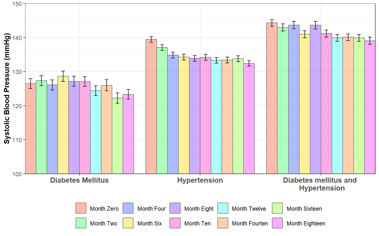
library(showtext)
library(ggtext)

font_add_google("Libre Franklin", "franklin")
font_add_google("Gelasio", "gelasio")
showtext_opts(dpi = 300)
showtext_auto()

data <- tribble(
  ~category,~gain,~none,~lose,~group,
  "Total",21,37,41,"total",
  "Men",24,42,34,"gender",
  "Women",18,34,47,"gender",
  "White",24,43,33,"race",
  "Black",11,20,66,"race",
  "Hispanic",17,29,52,"race",
  "Asian*",15,38,47,"race",
  "Ages 18-29",22,30,47,"age",
  "30-49",22,34,42,"age",
  "50-64",21,42,37,"age",
  "65+",17,43,39,"age",
  "Postgrad",17,38,45,"education",
  "College grad",17,43,39,"education",
  "Some college",22,33,43,"education",
  "HS or less",23,37,40,"education",
  "Rep/Lean Rep",35,51,13,"politics",
  "<span style='color:gray50'>Conserv</span>",39,54,6,"politics",
  "<span style='color:gray50'>Mod/Lib</span>",29,47,23,"politics",
  "Dem/Lean Dem",7,23,69,"politics",
  "<span style='color:gray50'>Cons/Mod</span>",8,25,66,"politics",
  "<span style='color:gray50'>Liberal</span>",6,20,74,"politics"
) %>%
  mutate(group = factor(
      group,
      levels = c("total", "gender", "race","age", "education", "politics")),
      category = factor(category, levels = rev(category)))

data %>%
  pivot_longer(
      -c(category, group),
      names_to = "effect",
      values_to = "percent") %>%
  mutate(
      effect = factor(effect, levels = c("lose", "none", "gain"))) %>%
  ggplot(aes(x = percent, y = category, fill = effect, label = percent)) +
  geom_col(width = 0.7) +
  geom_text(
      position = position_stack(vjust = 0.5),
      family = "franklin", size = 6, size.unit = "pt") +
  facet_grid(group~., scales = "free_y", space = "free_y") +
  coord_cartesian(expand = FALSE, clip = "off") +
  scale_fill_manual(
    name = NULL,
    breaks = c("gain", "none", "lose"),
    values = c("#D0A62D", "#DBD9C6", "#E3CA83"),
    labels = c("Gain influence", "Not be affected", "Lose influence")) +
  labs(
    title = "How Americans feel people like them<br>will fare under the Trump administration",
    subtitle = "*% who say **people like yourself** will in<br>Washington with Donald Trump taking office*",
    caption = "\\* Estimates for Asian adults are representative of English speakers<br>only.<br>Note: No answer responses are not shown.<br>Source: Survey of U.S. adults conducted Jan. 27-Feb. 2, 2025.<br><br>**<span style='color:black'>PEW RESEARCH CENTER</span>**",
    x = NULL,
    y = NULL) +
  theme(
    text = element_text(family = "franklin"),
    legend.position = "top",
    legend.justification.top = "right",
    legend.text = element_text(size = 6, margin = margin(l = 2)),
    legend.key.size = unit(5, "pt"),
    legend.key.spacing.x = unit(2, "pt"),
    legend.box.spacing = unit(8, "pt"),
    legend.margin = margin(r = 0),
    panel.grid = element_blank(),
    panel.background = element_blank(),
    strip.text = element_blank(),
    axis.ticks = element_blank(),
    axis.text.x = element_blank(),
    axis.text.y = element_markdown(size = 6, color = "black"),
    plot.title.position = "plot",
    plot.title = element_markdown(
        face = "bold", size = 9, lineheight = 1.4),
    plot.subtitle = element_markdown(
        family = "gelasio", size = 8,
        color = "gray40", lineheight = 1.2,
        margin = margin(b = 8)),
    plot.caption.position = "plot",
    plot.caption = element_markdown(
        hjust = 0, size = 5.5, lineheight = 1.4,
        color = "gray40", margin = margin(t = 16)),
    plot.margin = margin(t = 10, r = 8, b = 10, l = 3),
    panel.spacing.y = unit(15, "pt"))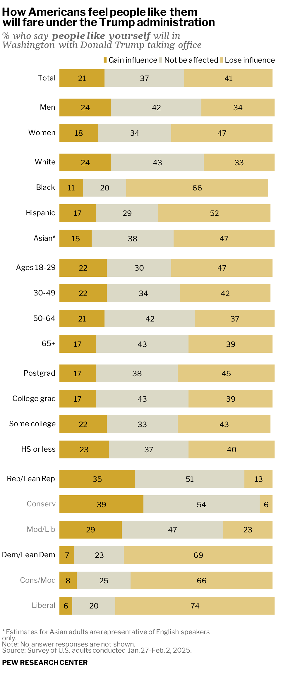
ggsave("gainers_losers.png", width = 2.53, height = 6)