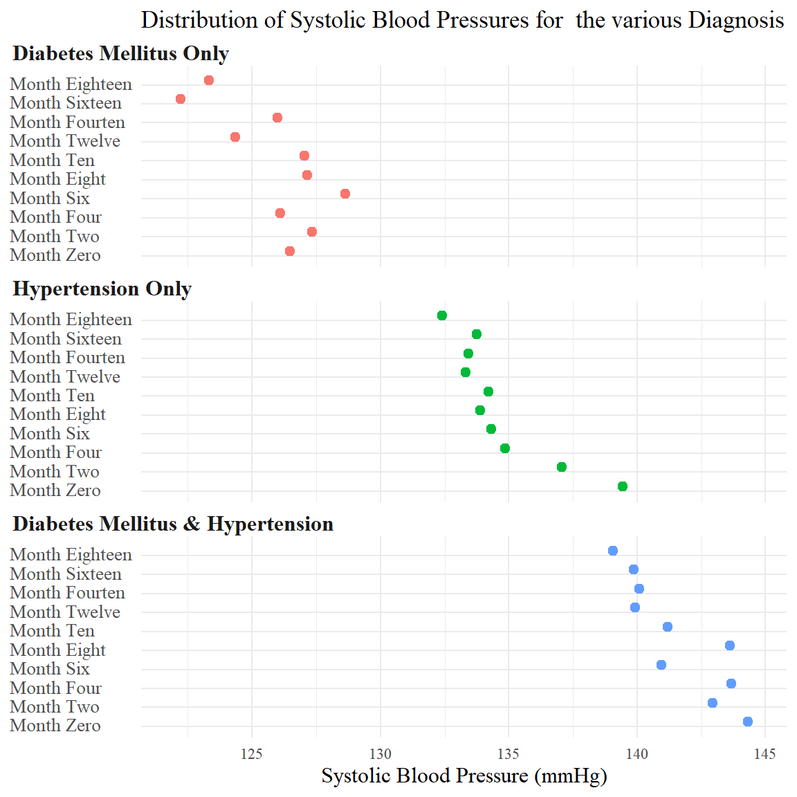
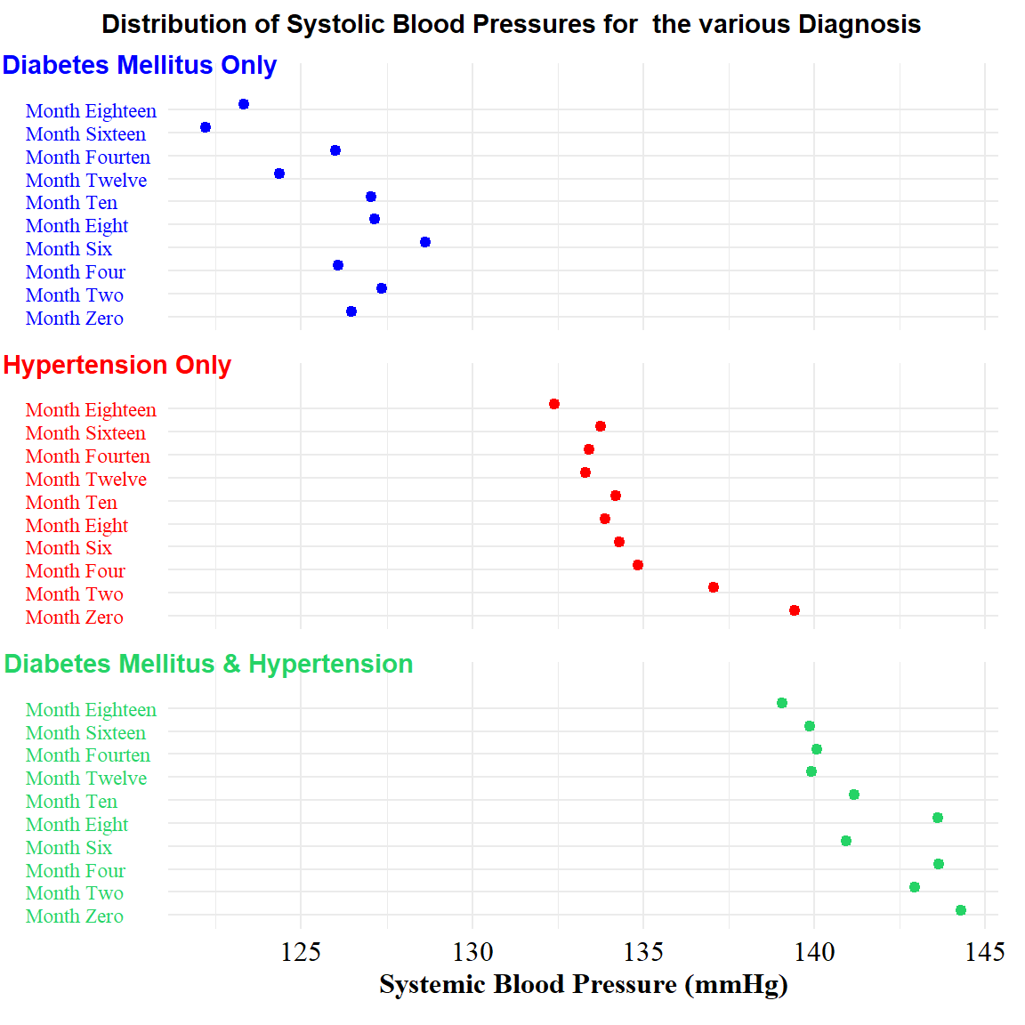
x_range <-
    df_sbp %>%
    pull(value) %>%
    range()


A <-
    df_sbp %>%
    filter(disease_class=="DM") %>%
    ggplot(aes(x = value, y = name))+
    geom_dotplot(color = "blue", binwidth = 0.3, fill = "blue")+
    scale_x_continuous(limits = x_range)+
    labs(x = NULL, y = NULL)+
    annotate(
        geom = "text", x = 122.3, y = 12, color = "blue",
        label = "Diabetes Mellitus Only", hjust = 0.75, fontface = "bold")+
    theme_minimal()+
    theme(
        text = element_text(family = "serif"),
        axis.text.y = element_text(color = "blue", hjust = 0),
        axis.text.x = element_blank(),
        title = element_text(
            size = 10, color = "blue", hjust = 1, face = "bold",
            margin = margin(l = -60, unit = "pt")))+
    coord_cartesian(clip = "off")

B <-
    df_sbp %>%
    filter(disease_class=="HPT") %>%
    ggplot(aes(x = value, y = name))+
    geom_dotplot(color = "red", binwidth = 0.3, fill = "red")+
    scale_x_continuous(limits = x_range)+
    labs(x = NULL, y = NULL)+
    annotate(
        geom = "text", x = 122.3, y = 12, color = "red",
        label = "Hypertension Only", hjust = 0.9, fontface = "bold")+
    theme_minimal()+
    theme(
        text = element_text(family = "serif"),
        axis.text.y = element_text(color = "red", hjust = 0),
        axis.text.x = element_blank(),
        title = element_text(
            size = 10, color = "red", hjust = 1, face = "bold",
            margin = margin(l = -60, unit = "pt")))+
    coord_cartesian(clip = "off")

C <-
    df_sbp %>%
    filter(disease_class=="DM+HPT") %>%
    ggplot(aes(x = value, y = name))+
    geom_dotplot(color = "#25D366", binwidth = 0.3, fill = "#25D366")+
    scale_x_continuous(limits = x_range)+
    labs(x = "Systemic Blood Pressure (mmHg)", y = NULL)+
    annotate(
        geom = "text", x = 122.3, y = 12, color = "#25D366",
        label = "Diabetes Mellitus & Hypertension",
        hjust = 0.5, fontface = "bold")+
    theme_minimal()+
    theme(
        text = element_text(family = "serif"),
        axis.text.y = element_text(color = "#25D366", hjust = 0),
        axis.text.x = element_text(color = "black", size = 12),
        axis.title.x = element_text(color = 'black', size = 12, hjust = 0.5),
        title = element_text(
            size = 10, color = "#25D366", hjust = 1, face = "bold",
            margin = margin(l = -60, unit = "pt")))+
    coord_cartesian(clip = "off")

A/B/C +
    plot_annotation(
        title = "Distribution of Systolic Blood Pressures for  the various Diagnosis",
    theme = theme(plot.title = element_text(size = 11, hjust = .5, face = "bold")))