Code
rm(list = ls(all = TRUE))
dat <-
    foreign::read.dta("C:/Dataset/bea_organ_damage_28122013.dta")
dataF <-
    readstata13::read.dta13(
        "C:/Dataset/olivia_data_wide.dta",
nonint.factors = TRUE)First we read in the data
rm(list = ls(all = TRUE))
dat <-
foreign::read.dta("C:/Dataset/bea_organ_damage_28122013.dta")
dataF <-
readstata13::read.dta13(
"C:/Dataset/olivia_data_wide.dta",
nonint.factors = TRUE)Next we select three variables for plotting, keep only the complete cases and then store the ggplot() into an object called BP.
BP <-
  dat %>%
  select(q12weight, q2idtype, q3sex) %>%
  na.omit() %>%
  ggplot(aes(x = q2idtype, y = q12weight, fill = q3sex))
Next we draw our boxplot with axis labels, title, axes format, and color specification.
BP +
  geom_boxplot() +
    theme_test() +
    labs(title="My Boxplot", x="Case or Control", y="Weight (hgs)") +
    theme(plot.title = element_text(size=15, face="bold"),
          axis.text.x = element_text(size=12),
          axis.text.y = element_text(size=12),
          axis.title.x = element_text(size=13),
          axis.title.y = element_text(size=13)) +
  scale_color_discrete(name = "Sex")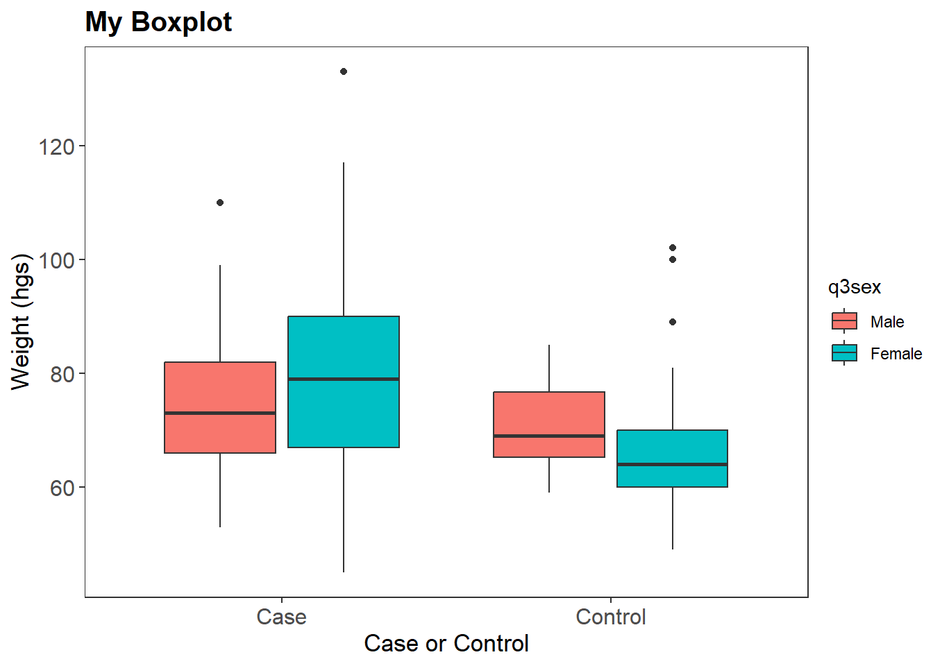
Newt we set up a similar boxplot but this time use the color option for the ggplot() and not the fill option.
BP <-
  dat %>%
  select(q12weight, q2idtype, q3sex) %>%
  na.omit() %>%
ggplot(aes(x = q2idtype, y = q12weight, color = q3sex))BP +
geom_boxplot() +
theme_light() +
labs(title = "My Boxplot",
x = "Case or Control",
y = "Weight (hgs)") +
theme(plot.title=element_text(size=15, face="bold"),
axis.text.x=element_text(size=12),
axis.text.y=element_text(size=12),
axis.title.x=element_text(size=13),
axis.title.y=element_text(size=13)) +
scale_color_discrete(name="Sex")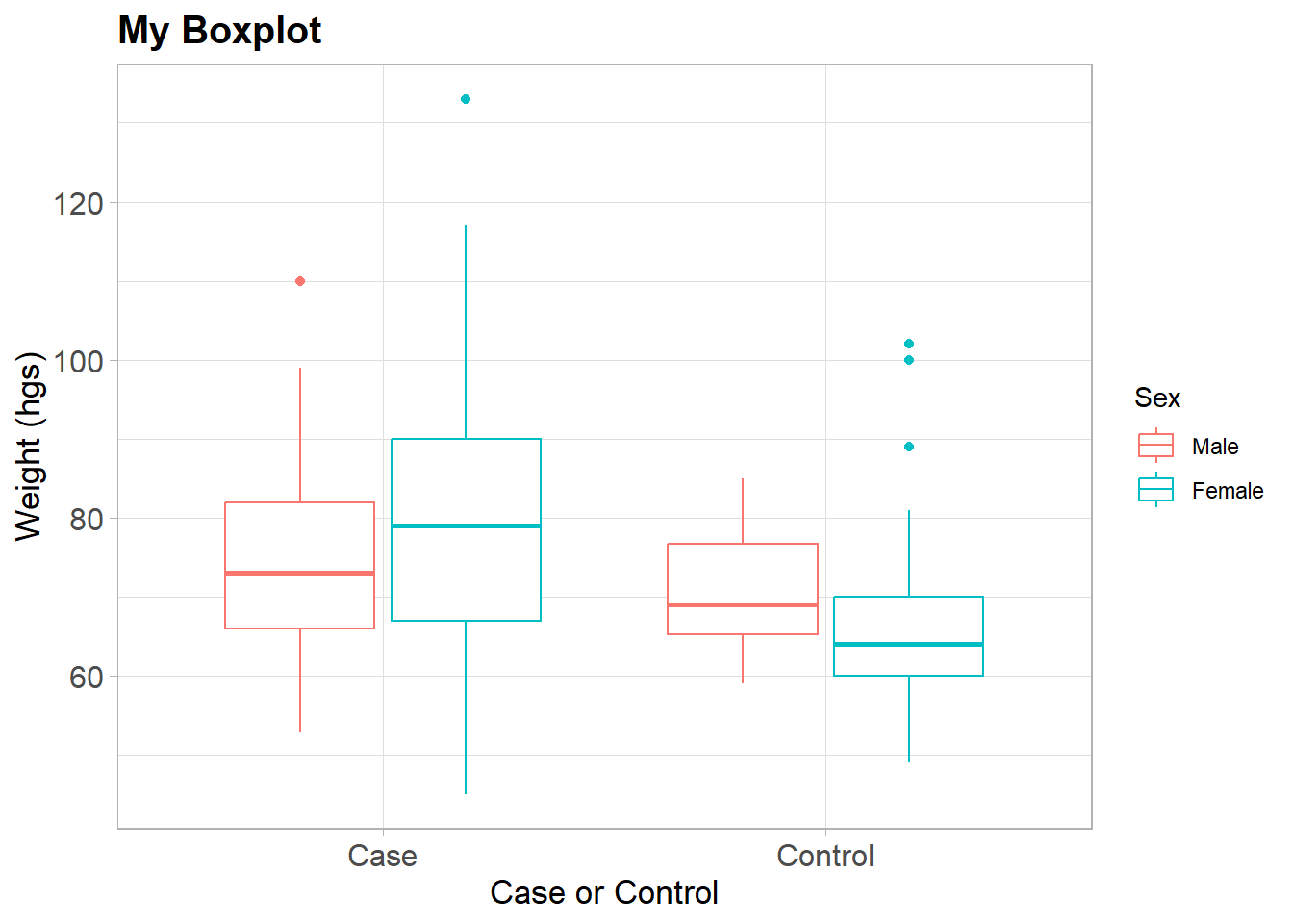
rm(BP, dat)Here we use a different dataset to draw the next boxplot
df1 <- read.csv("C:/Dataset/booking1.csv")Next we plot two boxplots on one graph
df1 %>%
  na.omit() %>%
  ggplot(aes(x = sex)) +
    geom_boxplot(aes(y = weight, color="red")) +
    geom_boxplot(aes(y = height, color = "steelblue")) +
  labs(color = "Anthropometrics") +
  scale_color_manual(labels = c("Weight","Height"),
                     values = c("red", "steelblue"))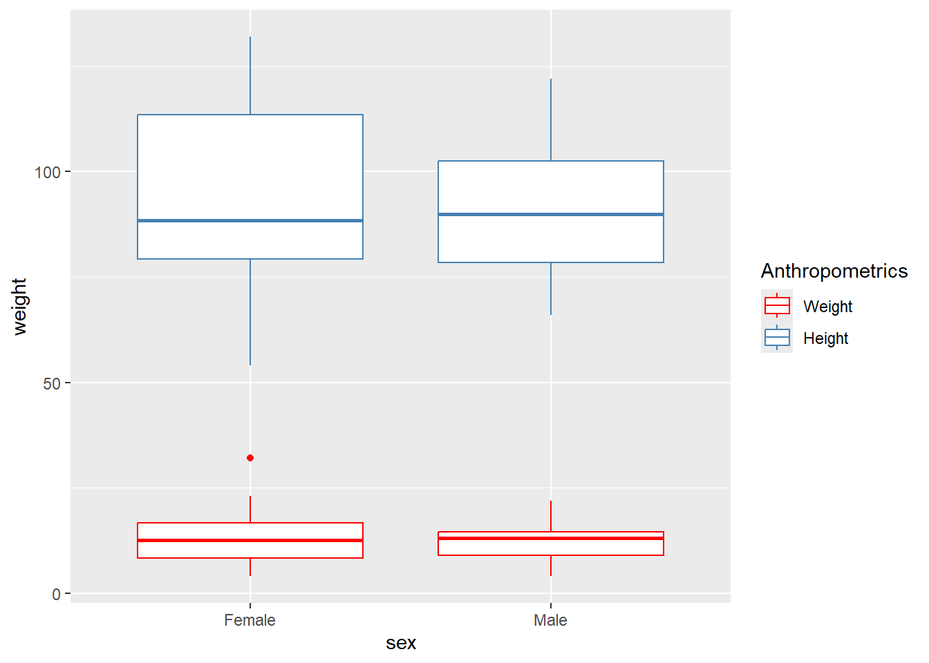
rm(df1)We then use the ToothGrowth data for for the next few boxplots
data(ToothGrowth)
ToothGrowth <-
  ToothGrowth %>%
  mutate(dose = factor(dose))

p <-
  ToothGrowth %>%
  ggplot(aes(x = dose, y = len))
And then we form the ggplot object
Other renditions of the boxplot is as shown below. First rotated one
p + geom_boxplot() + coord_flip() # Axis rotated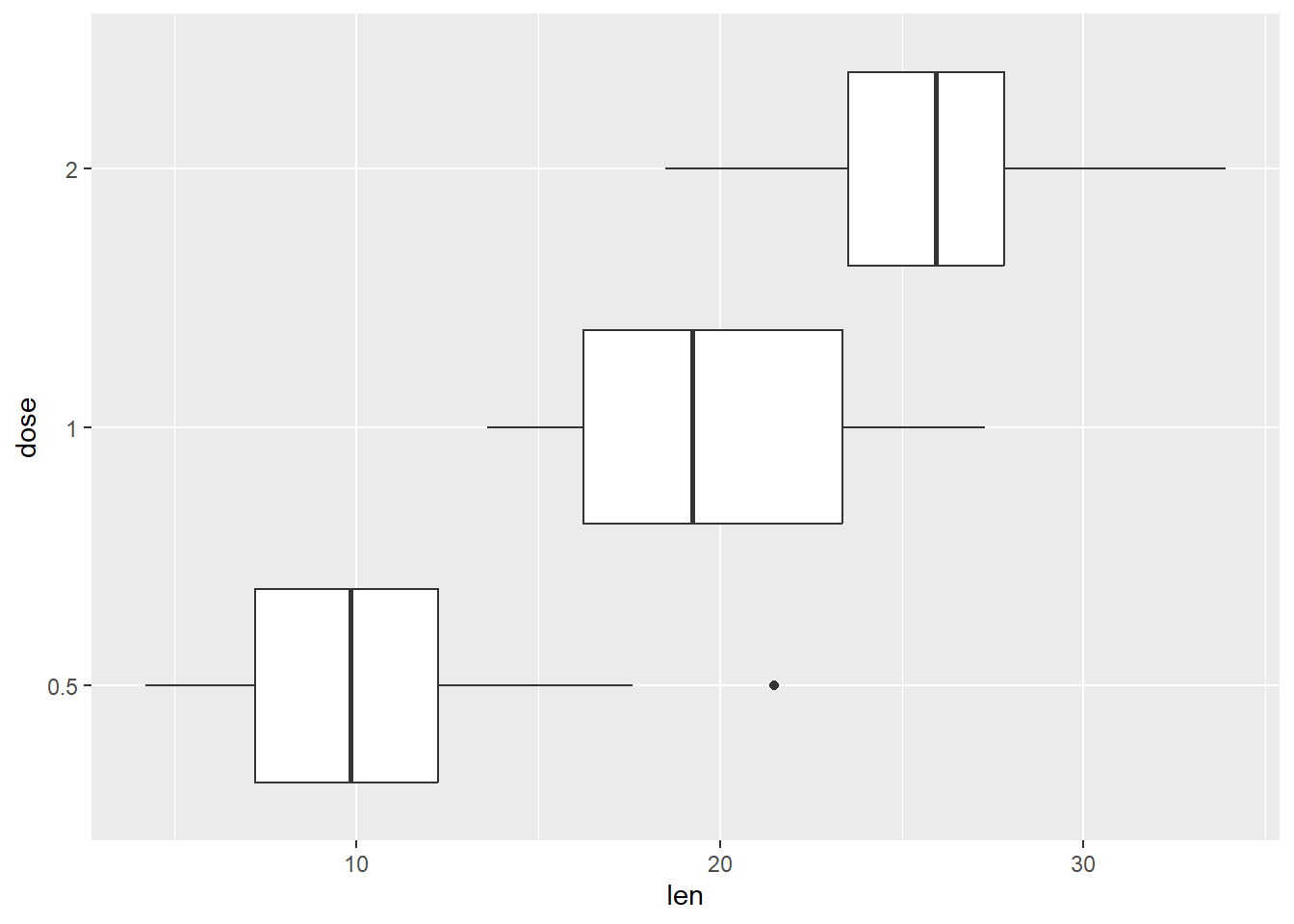
Notched boxplot
p + geom_boxplot(notch=TRUE)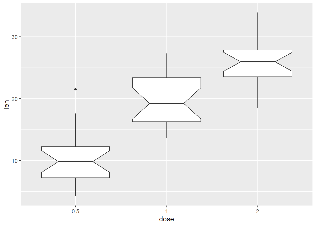
Customizaton of the outlier
p + geom_boxplot(
    outlier.colour="red", outlier.shape=8, outlier.size=4)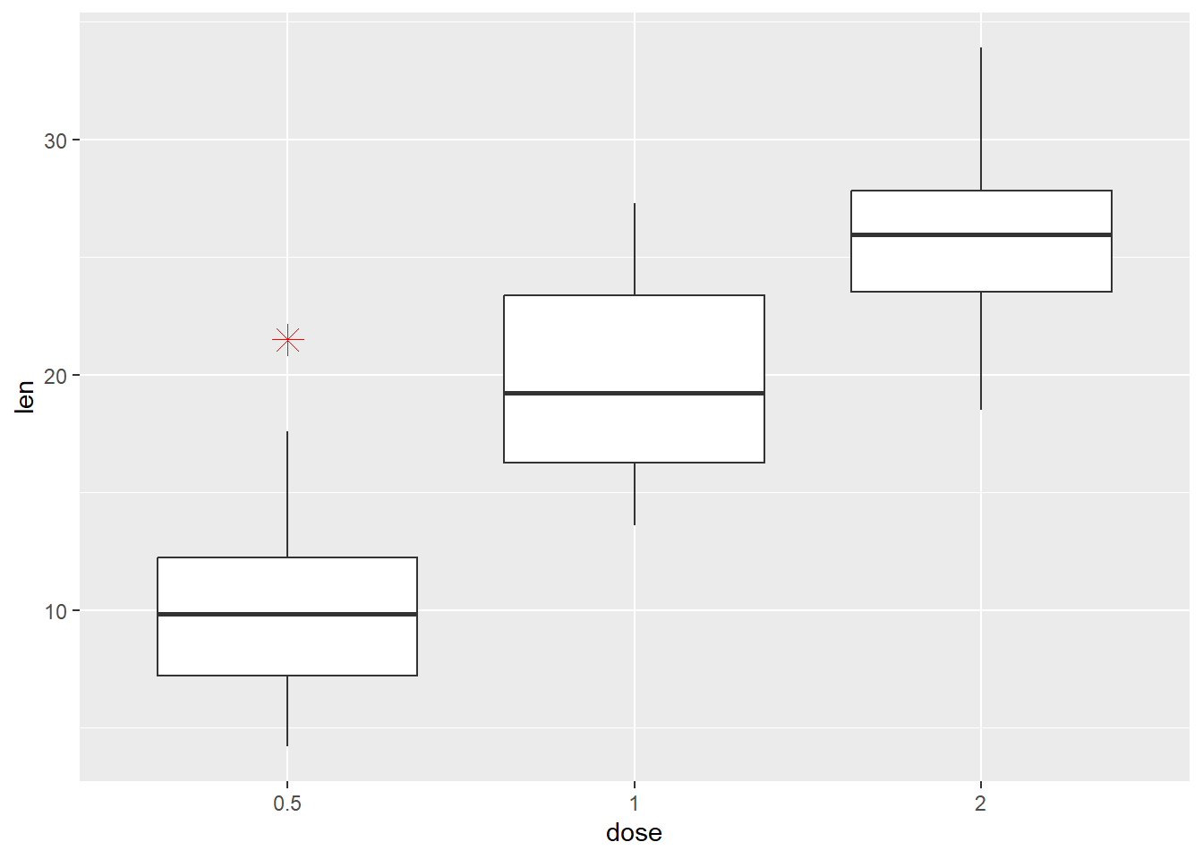
We add a statistic to the plot here
p + geom_boxplot() +
    stat_summary(
        fun = mean, geom = "point", shape = 18, size = 4, col = "red")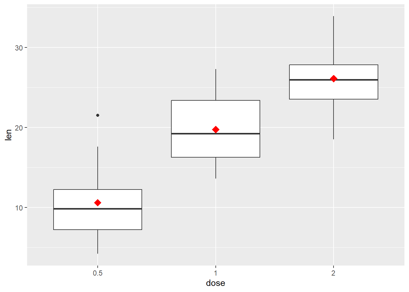
And then limit the categories the x axis
p +
  geom_boxplot() +
  scale_x_discrete(limits=c("0.5", "2"))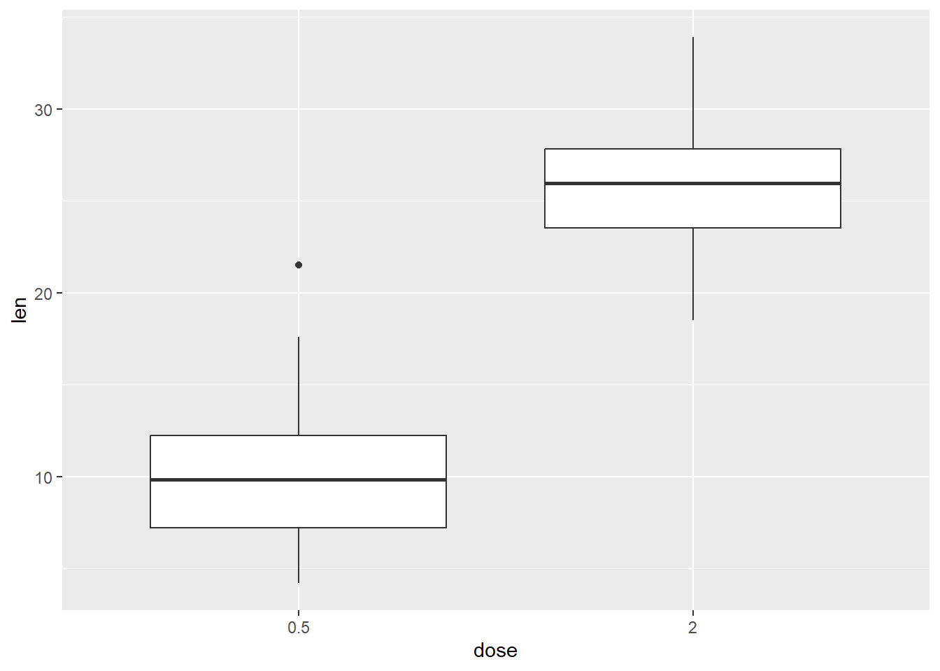
Next a boxplot with a superimposed dotplot
p +
  geom_boxplot() +
  geom_dotplot(
binaxis='y', stackdir='center', dotsize=0.5, binwidth = 1, col = "red") 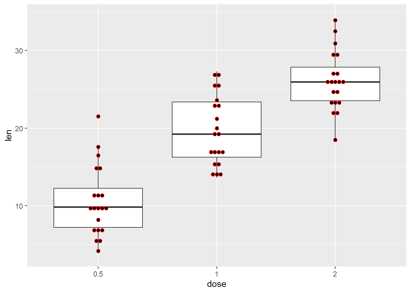
And a boxplot with superimposed jittered points
p +
  geom_boxplot() +
  geom_jitter(shape=16, position=position_jitter(0.2))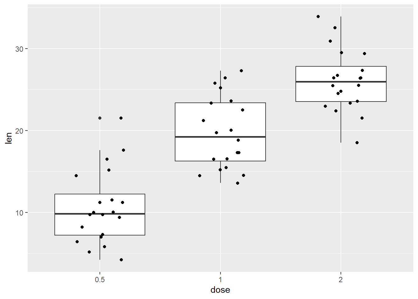
Next we manually set out own color scale
P <-
  ToothGrowth %>%
  ggplot(aes(factor(dose), len, color=dose))

P +
    geom_boxplot() +
  scale_color_manual(values=c("#999999", "#E69F00", "#56B4E9"))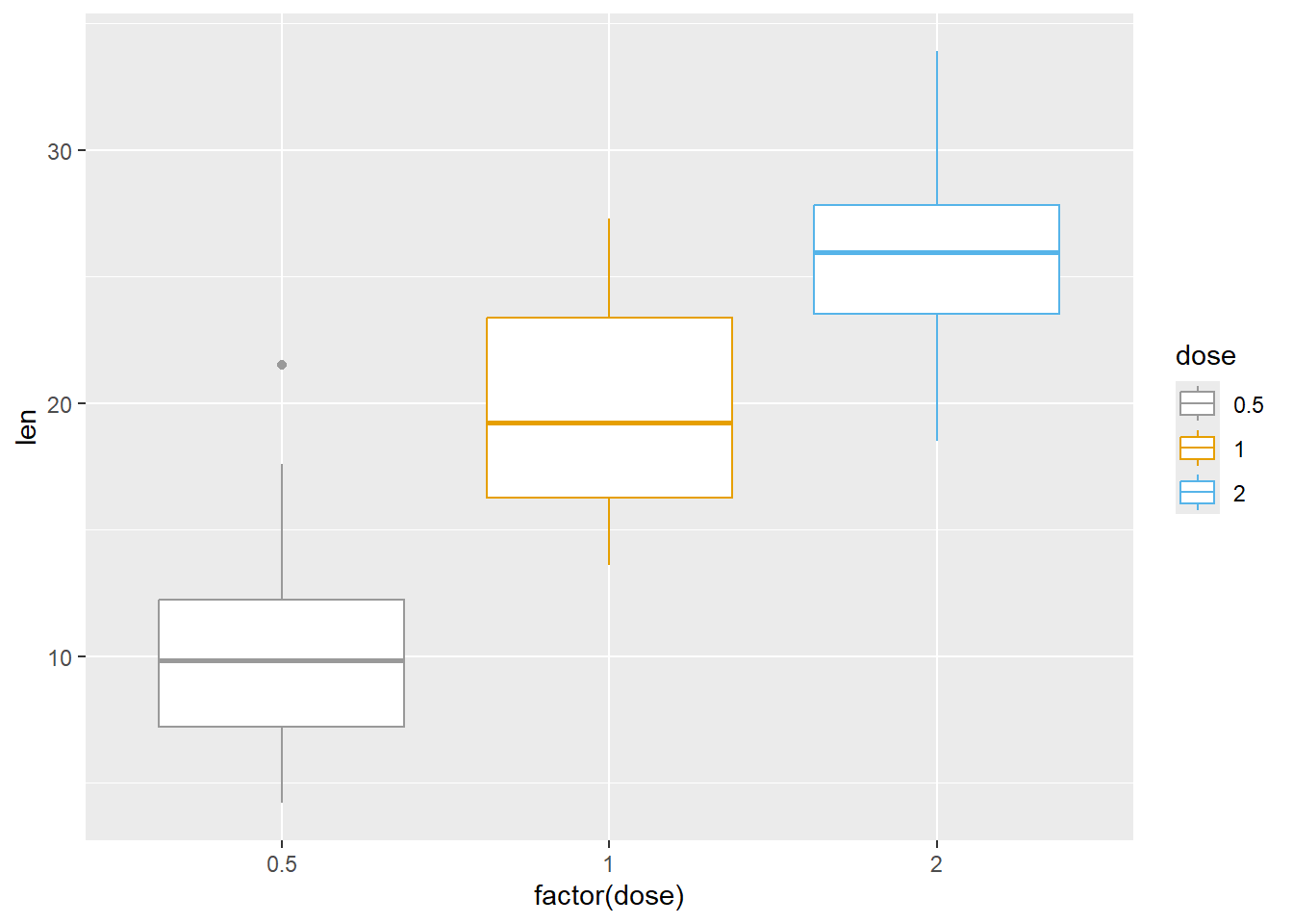
And use one of the color scales
P +
    geom_boxplot() +
    scale_color_brewer(palette="Dark2") +
    scale_fill_brewer(palette="Dark2")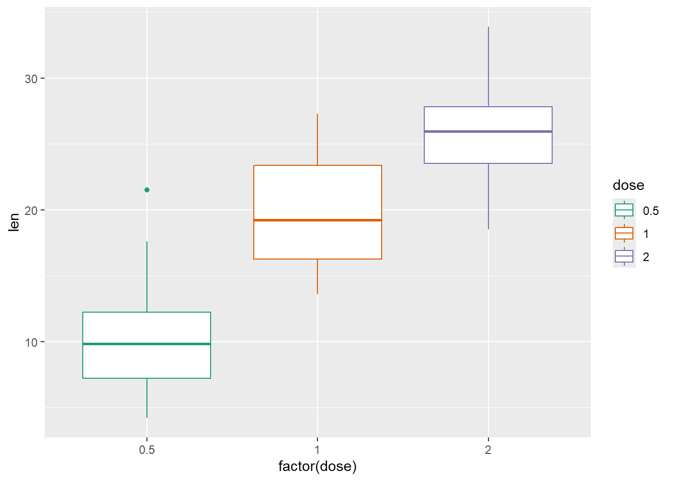
Change the legend position
P +
  geom_boxplot() +
  theme(legend.position = "top")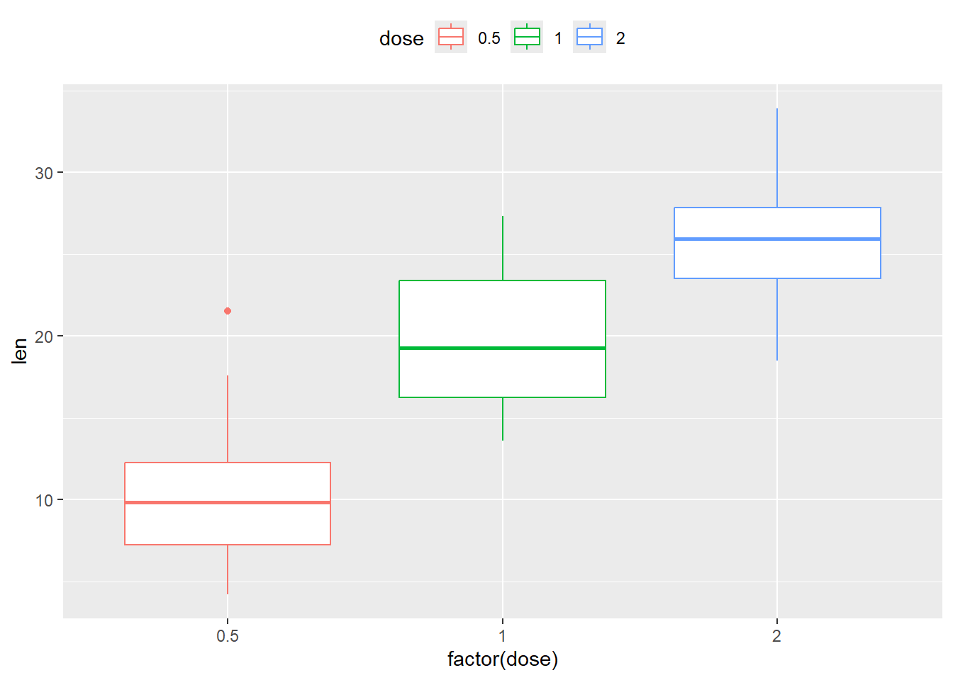
And remove legend
P +
  geom_boxplot() +
  theme(legend.position="none")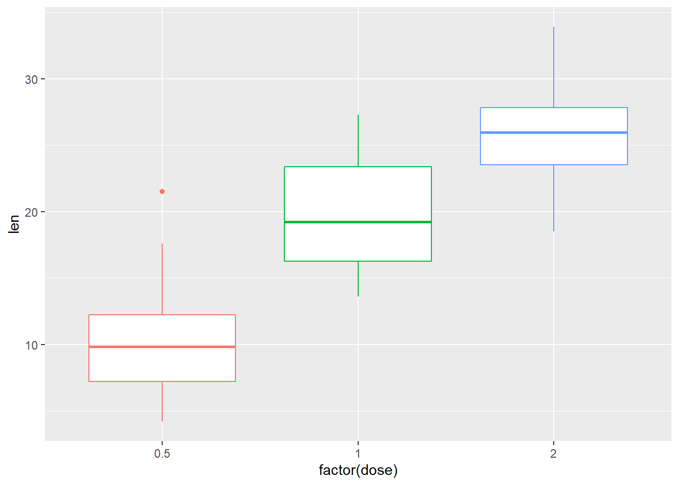
Change the order of items in the legend
P +
  geom_boxplot() +
  scale_x_discrete(limits=c("2", "0.5", "1"))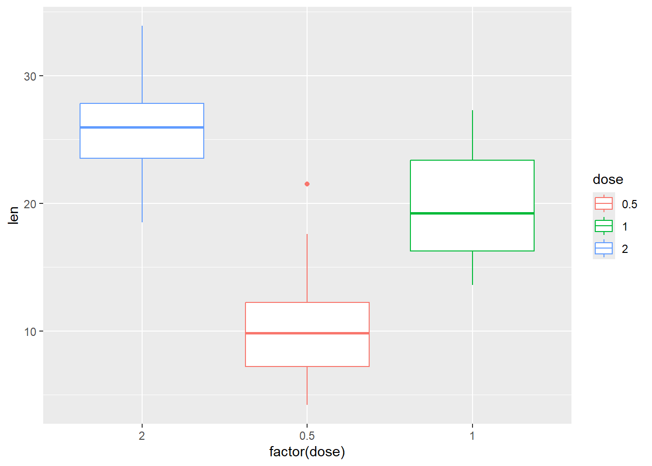
Change the position of the boxes
P <-
  ggplot(ToothGrowth, aes(x=dose, y=len, fill=supp)) +
    geom_boxplot(position=position_dodge(1))
P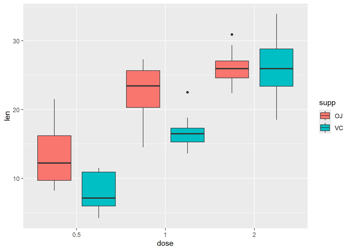
And then we add dots
P + geom_dotplot(binaxis='y', stackdir='center', position=position_dodge(1),
                 binwidth = 1)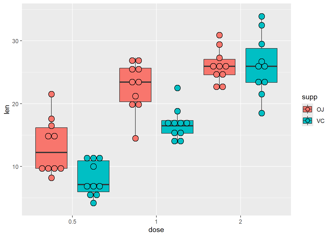
Customized
dataF %>%
    select(mcv1, mcv2, mcv3, mcv4, mcv5, agecat, id) %>%
    pivot_longer(cols = mcv1:mcv5, names_to = "Time", values_to = "MCV") %>%
    ggplot(aes(x = Time, y = MCV, col = Time), fill = "snow1") +
    geom_boxplot(
        outlier.color = 'black',
        outlier.shape = 23,
        outlier.fill = "steelblue2",
        outlier.size = 2) +
    stat_summary(
        aes(fill=Time),
        fun.data = mean_se,
        geom = "pointrange",
        size=0.5,
        shape =23,
        color = "black",
        show.legend = F) +
    scale_color_manual(
        name = "Measure",
        values = c("red", "yellow", "green", "violet", "brown"),
        labels = c("First","Second", "Third", "Fourth", "Fifth")) +
    scale_x_discrete(
        labels =c(
            "mcv1" = "First MCV",
            "mcv2" = "Second MCV",
            "mcv3" = "Third MCV",
            "mcv4" = "Fourth MCV",
            "mcv5" = "Fifth MCV")) +
    labs(title = "Distribution of MCVs over the review periods") +
    theme(
        plot.title = element_text(
            family = "serif",
            face = "bold.italic",
            size = 14,
            colour = "steelblue4",
            hjust = 0.5))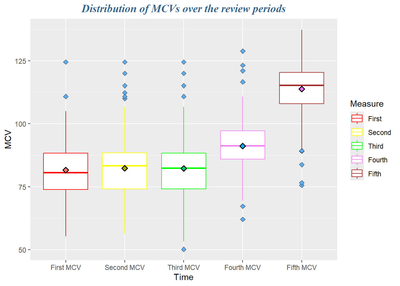
dataF %>%
    select(mcv1, mcv2, mcv3, mcv4, mcv5, agecat, id) %>%
    pivot_longer(cols = mcv1:mcv5, names_to = "Time", values_to = "MCV") %>%
    ggplot(aes(x = Time, y = MCV, col = Time), fill = "snow1") +
    geom_boxplot(outlier.color = "white", outlier.alpha = 0) +
    geom_jitter(width =.2, alpha = .2, col=1) +
    labs(
        x = "Time of Sample taking",
        y = "Mean Corpuscular Volume",
        title = "Sequential changes in MCV over the study duration") +
    theme_bw() +
    scale_x_discrete(
        labels = c(
            "mcv1" = "First MCV",
            "mcv2" = "Second MCV",
            "mcv3" = "Third MCV",
            "mcv4" = "Fourth MCV",
            "mcv5" = "Fifth MCV"))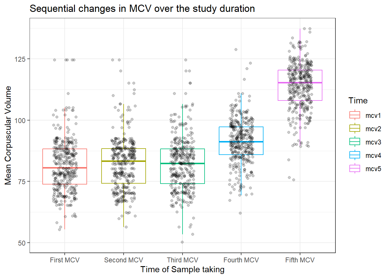
dataF %>%
    select(mcv1, mcv2, mcv3, mcv4, mcv5, agecat, id) %>%
    pivot_longer(cols = mcv1:mcv5, names_to = "Time", values_to = "MCV") %>%
    ggplot(aes(x = Time, y = MCV, col = Time), fill = "snow1") +
    ggbeeswarm::geom_beeswarm() +
    labs(x = "Time of Sample taking",
         y = "Mean Corpuscular Volume",
         title = "Sequential changes in MCV over the study duration") +
    theme_bw() +
    scale_x_discrete(
        labels = c(
            "mcv1" = "First MCV", "mcv2" = "Second MCV", "mcv3" = "Third MCV",
            "mcv4" = "Fourth MCV", "mcv5" = "Fifth MCV"))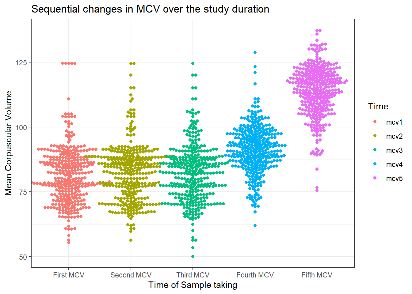
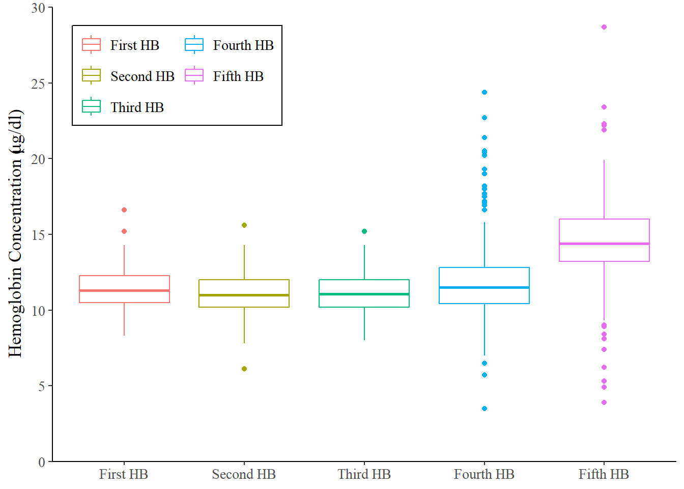
dataF %>%
    select(hb1, hb2, hb3, hb4, hb5, agecat, id) %>%
    pivot_longer(cols = hb1:hb5, names_to = "Time", values_to = "hb") %>%
    ggplot(aes(x = Time, y = hb, color = Time)) +
    geom_boxplot()+
    scale_x_discrete(
        name = NULL,
        labels = c(
            "hb1" = "First HB", "hb2" = "Second HB",
            "hb3" = "Third HB", "hb4" = "Fourth HB",
            "hb5" = "Fifth HB"))+
    scale_y_continuous(
        name = expression(paste('Hemoglobin Concentration (', mu, 'g/dl)')),
        limits = c(0, 30),
        breaks = seq(0, 30, 5),
        expand = c(0,0))+
    scale_color_discrete(
        name = NULL,
        labels = c(
            "hb1" = "First HB", "hb2" = "Second HB",
            "hb3" = "Third HB", "hb4" = "Fourth HB",
            "hb5" = "Fifth HB"))+
    guides(color=guide_legend(ncol=2,title = NULL))+
    theme_classic()+
    theme(
        text = element_text(family = "serif", size = 13),
        legend.background = element_rect(color = "black"),
        legend.position = "inside",
        legend.position.inside = c(0.2, 0.85),
        legend.direction = "horizontal")