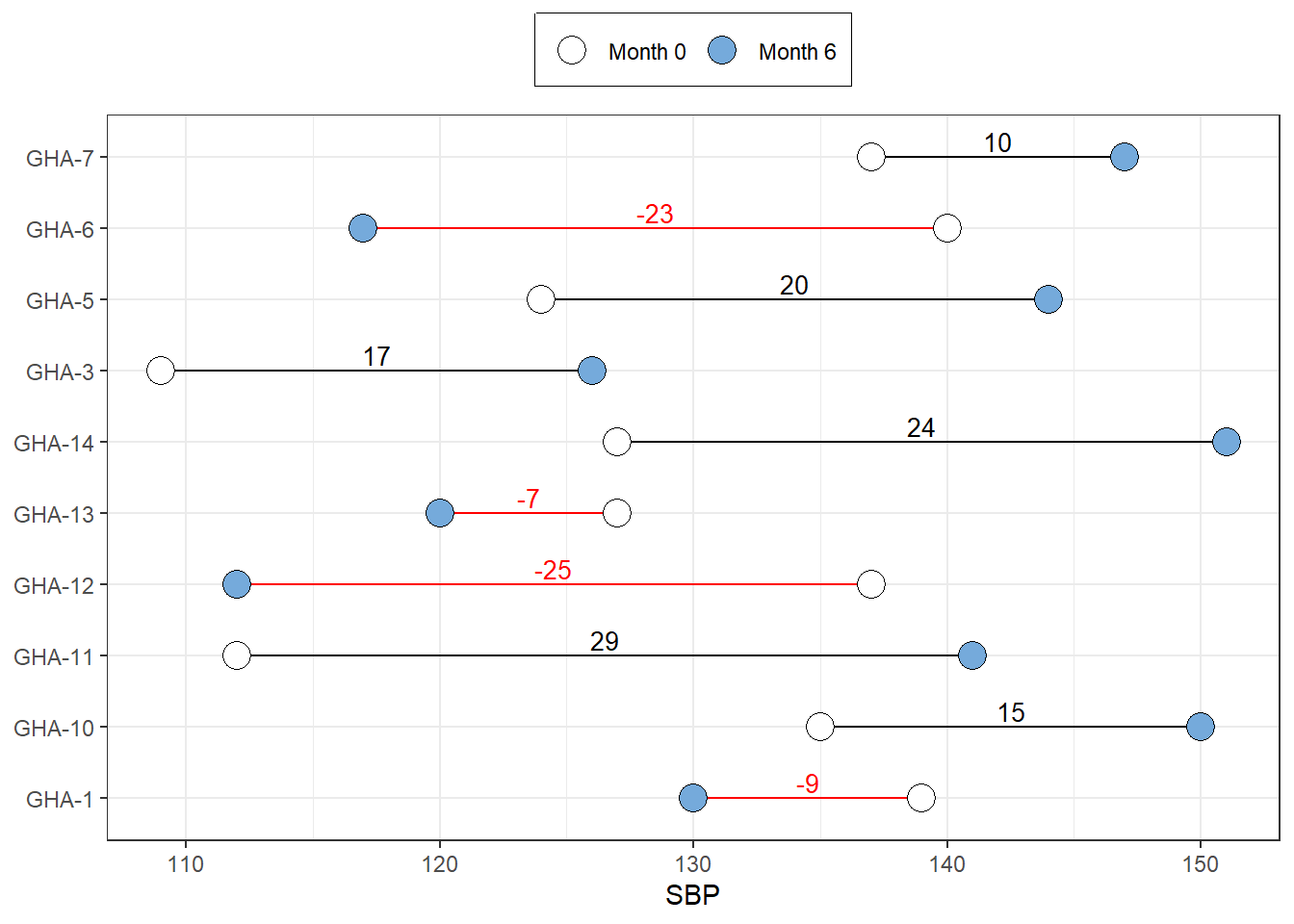
In this chapter, we draw a dumbell plot using ggplot. We do this using the first 10 record of systolic blood pressures measured 6 months apart for a group of hypertensive patients.
Code
<- :: read_xlsx ("C:/Dataset/SBPDATA.xlsx" ) %>% :: clean_names () %>% select (sid, sbp_0, sbp_6) %>% drop_na () %>% mutate (sid = paste0 ("GHA-" , sid),mean_bp = (sbp_0 + sbp_6)/ 2 ,diff_sbp = (sbp_6 - sbp_0),diff_sbp_cat = case_when (< 0 ~ "red" , diff_sbp >= 0 ~ "black" )) %>% head (n= 10 )<- %>% pivot_longer (cols = starts_with ("sbp" ), names_to = "Month" , values_to = "SBP" )
Next, we visualise the data
Code
%>% head () %>% kableExtra:: kable ()
GHA-1
139
130
134.5
-9
red
GHA-3
109
126
117.5
17
black
GHA-5
124
144
134.0
20
black
GHA-6
140
117
128.5
-23
red
GHA-7
137
147
142.0
10
black
GHA-10
135
150
142.5
15
black
Code
%>% head () %>% kableExtra:: kable ()
GHA-1
134.5
-9
red
sbp_0
139
GHA-1
134.5
-9
red
sbp_6
130
GHA-3
117.5
17
black
sbp_0
109
GHA-3
117.5
17
black
sbp_6
126
GHA-5
134.0
20
black
sbp_0
124
GHA-5
134.0
20
black
sbp_6
144
Then, we plot the diagram
Code
%>% ggplot (aes (x = SBP, y = sid, fill = Month))+ labs (y = NULL )+ geom_segment (data = df_dbl, aes (x = sbp_0, xend = sbp_6, y = sid, color = diff_sbp_cat), inherit.aes = F)+ geom_point (size = 5 , color = "black" , shape = 21 )+ annotate (geom = "text" ,x = df_dbl$ mean_bp, y = df_dbl$ sid, label = df_dbl$ diff_sbp,color = df_dbl$ diff_sbp_cat,size = 3.5 , vjust = - 0.3 )+ theme_bw ()+ scale_color_discrete (breaks = c ("sbp_0" , "sbp_6" ),labels = c ("Month 0" , "Month 6" ))+ scale_fill_manual (breaks = c ("sbp_0" , "sbp_6" ),labels = c ("Month 0" , "Month 6" ),values = c ("white" , "#75AADB" ))+ scale_color_identity ()+ theme (legend.position = "top" , legend.title = element_blank (), legend.box.background = element_rect (color = "black" ))
Scale for colour is already present.
Adding another scale for colour, which will replace the existing scale.