Introduction
An error plot (confidence interval plot) visually represents a statistic with its uncertainty. It is often drawn to show the range within which one can reasonably expect to see the statistic if the experiment is repeated on multiple occasions. Key components include:
Point Estimate : This is the central value, such as the mean, often represented by a dot or a small line.
Error Bars : These lines extend from the point estimate to indicate the upper and lower bounds of the confidence interval.
Plots
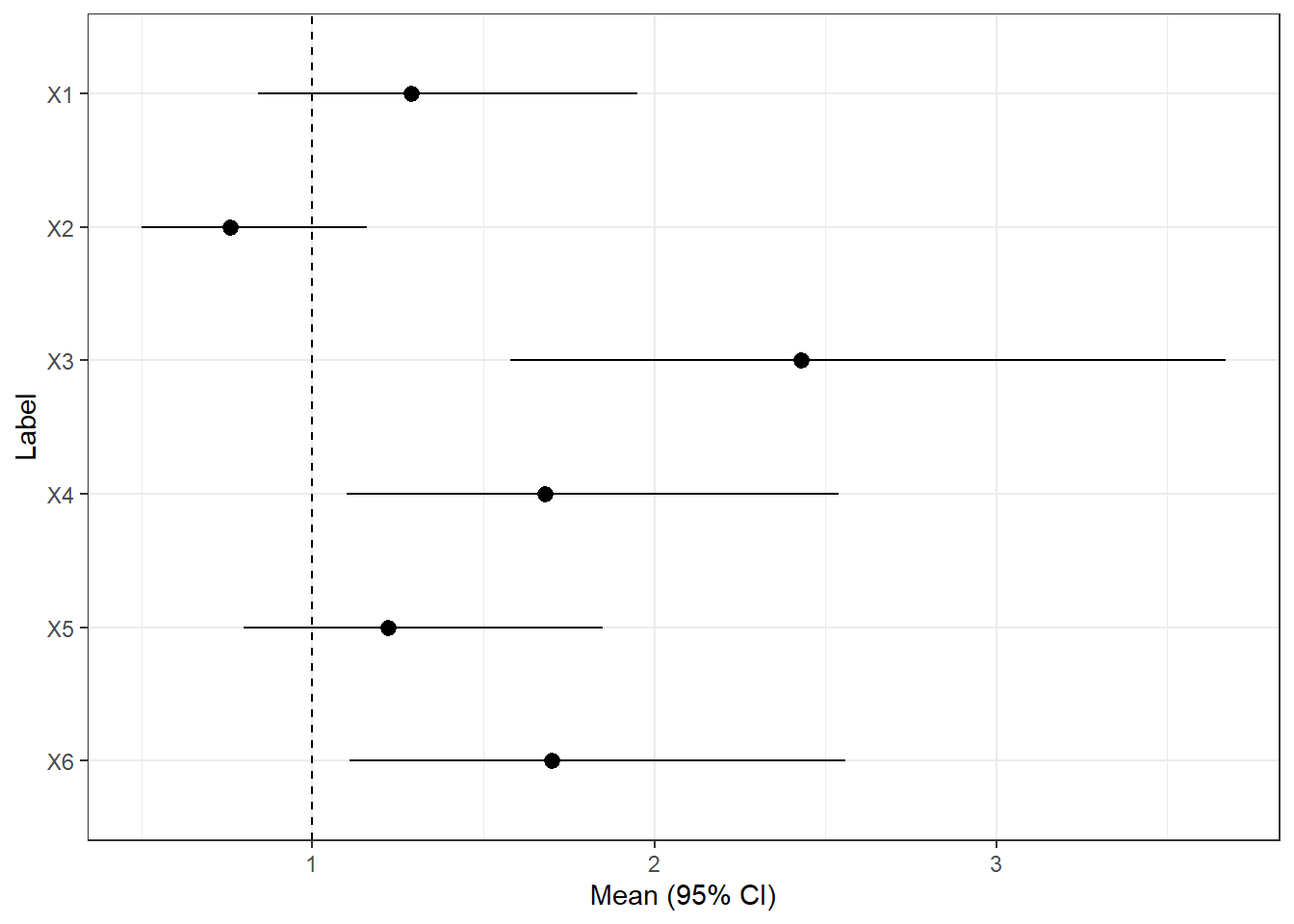
We begin by creating one from fictitious data. The data is as shown below:
Code
<- paste0 ("X" , 1 : 6 )<- c (1.29 ,0.76 ,2.43 ,1.68 ,1.22 ,1.7 ) <- c (0.84 ,0.50 ,1.58 ,1.1 ,0.8 ,1.11 )<- c (1.95 ,1.16 ,3.67 ,2.54 ,1.85 ,2.56 )<- data.frame (label, mean, lower, upper)$ label <- factor (df$ label, levels= rev (df$ label))%>% kableExtra:: kable ()
X1
1.29
0.84
1.95
X2
0.76
0.50
1.16
X3
2.43
1.58
3.67
X4
1.68
1.10
2.54
X5
1.22
0.80
1.85
X6
1.70
1.11
2.56
We the plot the data below
Code
library (ggplot2)<- ggplot (data = df, aes (x= label, y= mean, ymin= lower, ymax= upper)) + geom_pointrange () + geom_hline (yintercept= 1 , lty= 2 ) + coord_flip () + xlab ("Label" ) + ylab ("Mean (95% CI)" ) + theme_bw () print (fp)
In this example, we will construct the error plots from raw data. The first few rows are shown below.
Code
<- :: read_xlsx ("C: \\ Dataset \\ SBPDATA.xlsx" ) %>% :: clean_names () %>% select (%>% mutate (a1_gender = factor (levels = c (0 ,1 ), labels = c ("Female" ,"Male" ))) %>% pivot_longer (cols = sbp_0: sbp_18, names_to = "month" , values_to = "sbp" ) %>% drop_na () %>% head () %>% kableExtra:: kable ()
HPT
Female
sbp_0
139
HPT
Female
sbp_6
130
HPT
Female
sbp_12
80
HPT
Female
sbp_18
135
DM+HPT
Female
sbp_0
155
HPT
Female
sbp_0
109
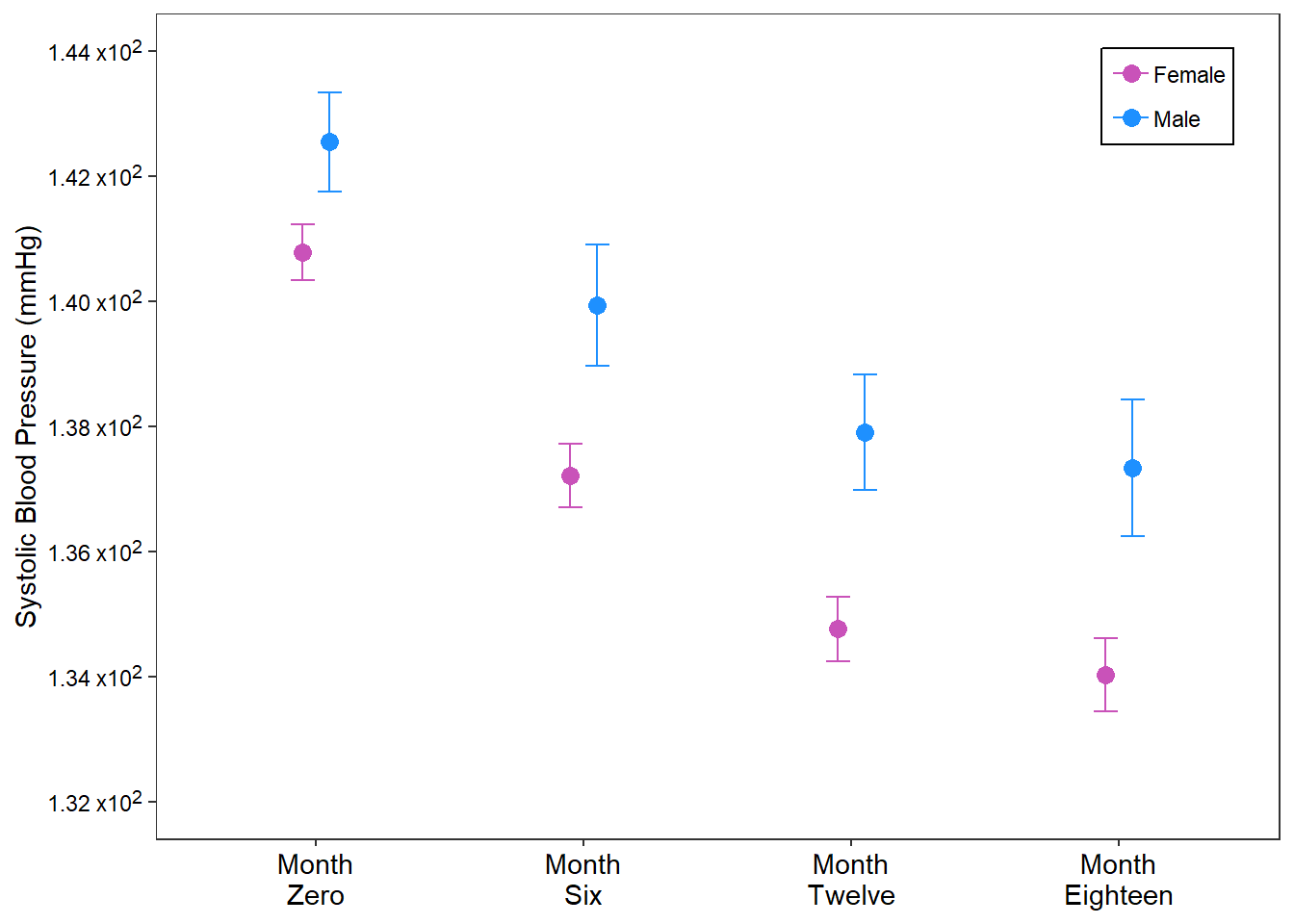
For this example, we summarise the raw data into its mean and standard errors and plot the means with one standard error on both sides for each BP checked per visit. Not that this is stratified by sex.
Code
%>% group_by (a1_gender, month) %>% reframe (across (sbp, ~ epiDisplay:: ci.numeric (.x))) %>% unnest (sbp) %>% mutate (month = factor (levels = c ("sbp_0" , "sbp_6" , "sbp_12" , "sbp_18" ))) %>% ggplot (aes (x = month, y = mean, ymin = mean - se, ymax = mean+ se,color = a1_gender)) + geom_errorbar (position = position_dodge2 (width = 0.4 ),width = 0.2 ) + geom_point (position = position_dodge2 (width = 0.2 ),size = 3 )+ labs (x = NULL , y = "Systolic Blood Pressure (mmHg)" ,color = NULL + theme_bw ()+ scale_x_discrete (breaks = c ("sbp_0" , "sbp_6" , "sbp_12" , "sbp_18" ),labels = c ("Month \n Zero" , "Month \n Six" , "Month \n Twelve" , "Month \n Eighteen" ))+ scale_y_continuous (breaks = seq (132 , 144 , 2 ),limits = c (132 , 144 ),labels = c ("1.32 x10<sup>2</sup>" ,"1.34 x10<sup>2</sup>" ,"1.36 x10<sup>2</sup>" ,"1.38 x10<sup>2</sup>" ,"1.40 x10<sup>2</sup>" , "1.42 x10<sup>2</sup>" , "1.44 x10<sup>2</sup>" ))+ scale_color_manual (breaks = c ("Female" , "Male" ),values = c ("#C952B9" ,"dodgerblue" )+ theme (legend.position = "inside" ,legend.position.inside = c (0.9 , 0.9 ),legend.background = element_rect (color = "black" ),axis.text.y = element_markdown (),axis.text = element_text (color = "black" ),panel.grid = element_blank (),legend.spacing = unit (0 , "pt" ), axis.text.x = element_text (size = 11 ),legend.margin = margin (t = 1 , b = 2 ,r = 3 , l = 3 ),legend.key.spacing = unit (0 , "pt" )
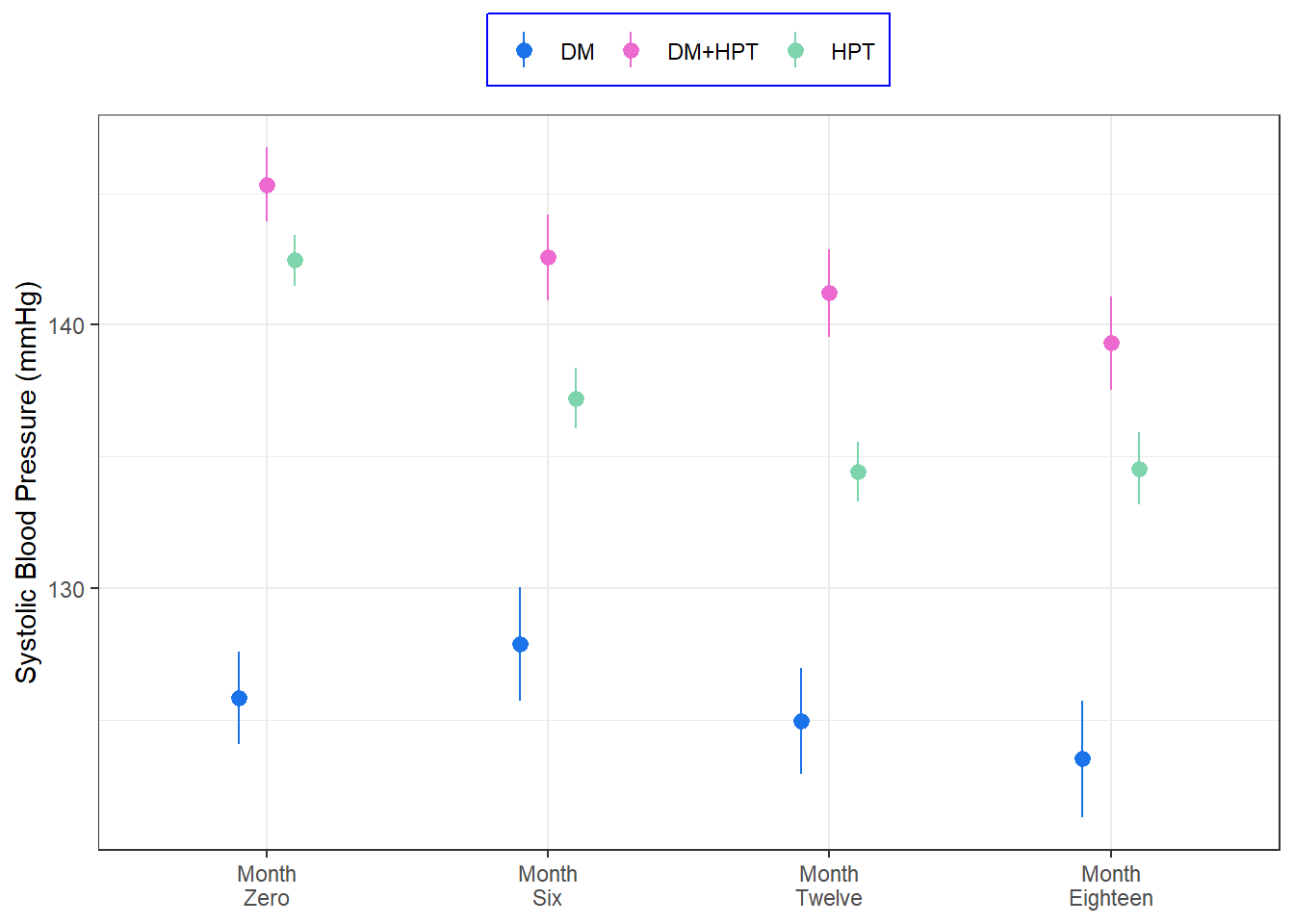
The final plot uses a function derived variables from stat_summary to plot the mean and 95% confidence intervals, stratified by the disease condition
Code
<- function (x){data.frame (y = epiDisplay:: ci.numeric (x)[[2 ]],ymin = epiDisplay:: ci.numeric (x)[[5 ]],ymax = epiDisplay:: ci.numeric (x)[[6 ]])%>% mutate (month = factor (levels = c ("sbp_0" , "sbp_6" , "sbp_12" , "sbp_18" ))) %>% ggplot (aes (x = month, y = sbp,color = disease_class)) + stat_summary (geom = "pointrange" , fun.data = fun_one, position = position_dodge (width = 0.3 )) + labs (x = NULL , color = NULL )+ scale_y_continuous (name = "Systolic Blood Pressure (mmHg)" )+ scale_color_manual (values = c ("#1A73E8" ,"#EC6ACF" , "#7ED4AD" )) + scale_x_discrete (breaks = c ("sbp_0" , "sbp_6" , "sbp_12" , "sbp_18" ),labels = c ("Month \n Zero" , "Month \n Six" , "Month \n Twelve" , "Month \n Eighteen" ))+ theme_bw ()+ theme (legend.position = "top" ,legend.background = element_rect (color = "blue" )